


Client Project • SaaS Web App • Product Design
Note: All instances of the client's brand have been obscured, and the platform's name in this case study has been changed to Brandables for client confidentiality.
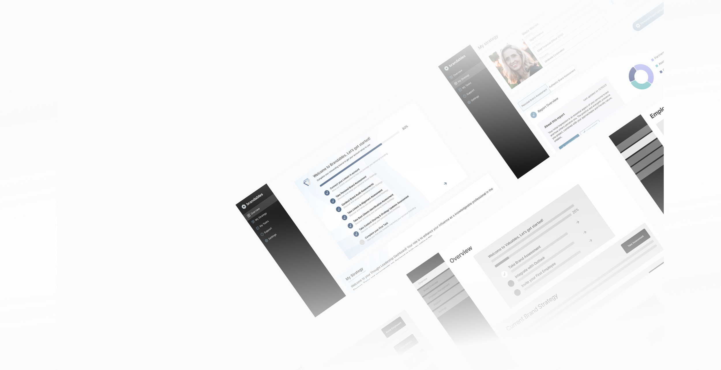
My Deliverables
Master Platform Architecture, Strategy Whiteboards, Low fidelity Wire flows, & Design System

Project Kickoff
Project Guidelines
01/21
I was placed in a design team with two other designers and assigned to a client facilitated by Springboard. The client gave us a project brief to help us familiarize ourselves with the client and the work we would be doing before our introduction. Our team was given four weeks to meet with the client, negotiate the scope and plan of the project, and execute the decided project plan. The brief stated that the project we would be working on was the client's SaaS platform, which aimed to provide branding services. The goal would be to optimize the platform's user experience by identifying bottlenecks in key user journey(s) and improving drop-off rates. The client stated in the brief that this would be measured by creating an approved prototype for testing.
Role - Team lead, Interaction, & UI Designer
Timeline - 5 Weeks
Team - Paxton Tomko, Lola Less, & Maxine Wu
Tools - Figma, Asana, Figjam, Notion, Slack, Google Sheets, Google Docs, and Google Drive
02/21
Project Planning
I knew we had a lot of uncertainty and unknowns going into the start of this project, so I decided to figure out what we did know and what we needed to know. We took inventory of what information we knew and what we still needed to learn to put together a high-level project timeline. We generated a discovery meeting agenda and a list of questions to help us better understand the client and their product and how we could best provide value for them. As the brief suggested, we would be doing usability improvement and testing, I planned for metrics to help us measure our designs' usability.


Identifier Metrics
I planned to use abandonment rates, error rates, task success rates, and time-on-task metrics to help discover potential issues.
Usability Metrics
Additional behavior metrics I planned to use were: time on task, session duration, user feedback, and SUS scores to measure usability issues in testing.
Perception Metrics
I planned to track CSAT scores, survey anecdotes, and SEQ answers to measure user perception and satisfaction.
03/21
Team Organization
Assessing what we knew helped me understand what tools & resources we would need as a team to help us complete the project and work effectively together while remote. The first tool I knew we would need was a knowledge management application to store documents and files and share them easily. We would also need a design tool, of course, to create the designs. To strategize, create information architecture, and share ideas remotely, we needed a whiteboard & collaboration tool. To conduct research, we would need tools for performing various types of research and testing as well as sourcing participants. One of the last tools we needed was a project management tool. With tasks pouring in throughout the project, I knew we would need this to work in a lean UX and agile manner.

Communication Tool
We used slack as our messaging tool to keep in contact and communicate with each other remotely.
Project Management Tool
We decided to use Asana to eliminate confusion, make sure everyone on the team knew what they needed to do and when they needed to do it and track our team's progress on the project.

Notes Tool
For this tool, we decided to use Notion for internal team documents and note-taking.
Documentation Tool
For final documents or client documents, we decided to use Google Docs.
Storage Tool
We decided to use Google Drive as our master storage tool as it would allow for easy handoff to the client at the end of the project.
Lastly, we needed a storage tool for all the documents and deliverables we'd produce. I suggested tools I've worked with or knew of and asked for recommendations before having us decide as a team what tools we wanted to use to foster buy-in and collaboration from the team. I then set up a weekly meeting call and a team workspace in Notion to ensure our team could work efficiently. The team workspace gave a central location for collaboration. It housed all our team documents and links to all the tools we would use and any meeting notes we took during the project. This workspace helped to eliminate any confusion between team members on where to find or pass off files. It also made everything easily accessible for the team.

Design Tool
It was an easy decision to use Figma as our design tool of choice. I created a Figma project to organize all our team Figma files.
Whiteboard Tool
We used Figjam for our whiteboard and strategy tool. This made it easy to keep track of with our other Figma files and share with the client.
Participant Sourcing Tools
We used Google Forms for creating surveys and planned to use User Interviews for sourcing and conducting interviews.
Architecture Testing
To test information architecture we used Optimal Workshop. This would help us measure users’ mental models.
Usability Testing
For conducting prototype usability testing we planned on using the testing platform Maze.
04/21
05/21
Discovery
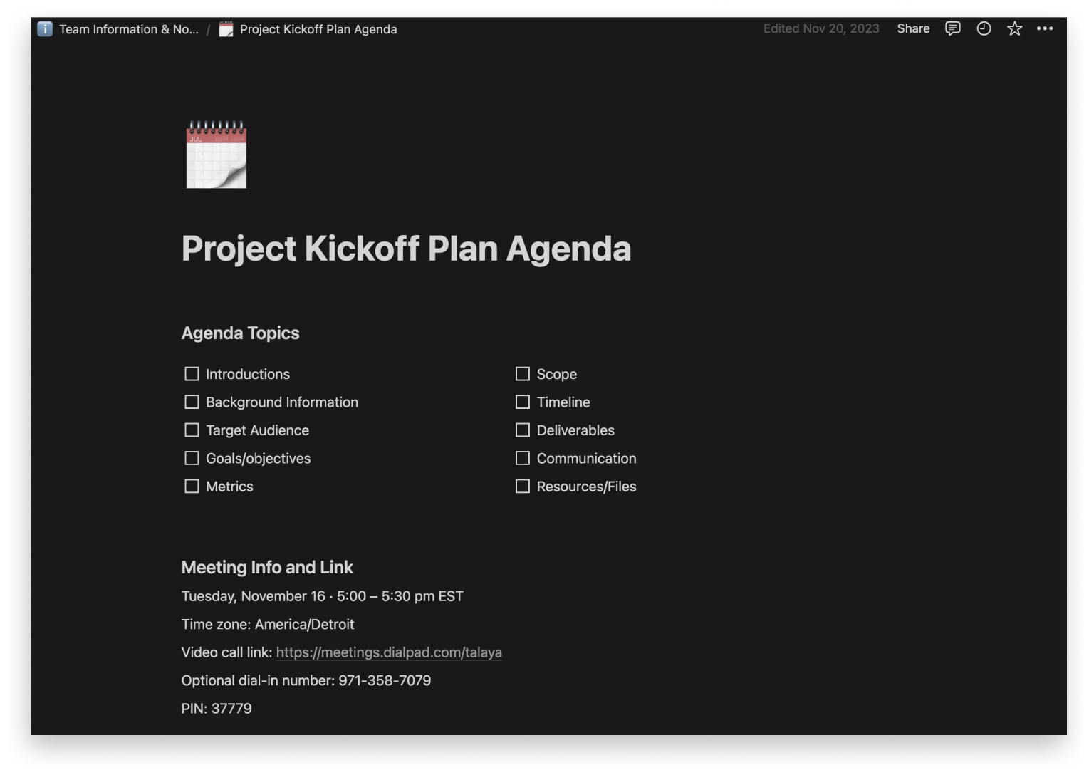
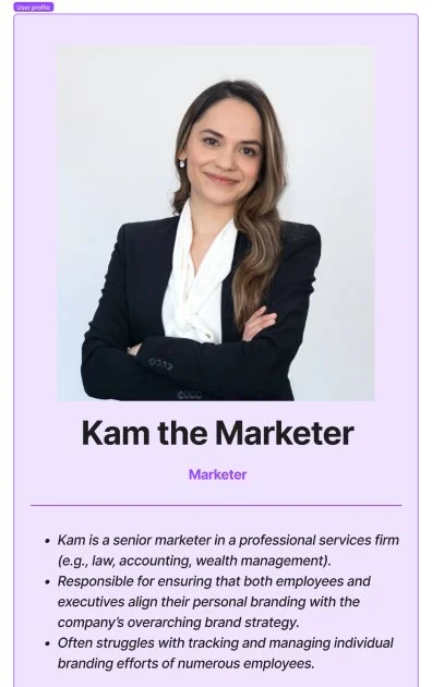
With our team feeling prepared, I contacted the client to begin our Kickoff and Discovery meeting. Finding a time to meet with the client presented a hiccup due to our client’s scheduling availability. To prevent us from getting delayed, I emailed the client to learn more about the project and see if there was anything we could get started on. The client sent over a Figma file of their platform and expressed they wanted us to work on the Onboarding section at the top of the document. They also sent over a document detailing the user flow for the onboarding process and our request for any user personas she already had for her target audience—the user personas outlined two key personas, A marketer and an employee. In preparation for our meeting, I reviewed the documents with the team and noticed that we all had confusion about the navigation and features as suggested by the onboarding flow. We added these to the meeting agenda to talk through with the client.
Re-defining the Problem

After reviewing the documents the client sent over and meeting with them, we discovered they had already conducted expert interviews to establish user stories and two new user personas. The client felt they had finally found their product market fit with a new audience than they previously were targeting, and subsequently, they were redesigning the entire platform. During our discussion, we discovered that the onboarding section we were working on was the entirety of the most updated version of the platform. The client was looking to redesign the rest of the platform based on the screens in the onboarding section. They weren't quite sure how we could help them, but we discovered that the project was no longer a usability improvement design project but an MVP design project. This discovery surprised the team and me and was not what we had anticipated from the project brief.

Pivoting the Project Plan
Following our initial meeting with the client, I had to adapt our project plan to suit our new direction. This discovery presented the team and me with even more uncertainties. We discussed our team roles, and since it seemed heavy on the information architecture, I also agreed to help with the Architecture. Our first challenge was to create a new plan and scope the client could agree to. I began collaborating with the team to help me write a project plan and Gantt chart timeline. I then used these documents to propose and gain buy-in from the client on how we could help them. With our new project plan, we aimed to begin by consolidating and benchmarking where the current architecture was so we could then update the high-fidelity designs. After this, we would create a prototype to conduct usability testing with.

With the amount of information we had, it was still unclear what areas would be of most value to test. I decided to provide a high-level view of the process in the project plan and timeline to outline the time needed. The other new challenge was figuring out how to make sure we would stay on the same page with the client moving forward throughout the project. Time became a difficulty here again. Our client didn’t have time they could waste in meetings, and our team had a deadline for working with the client. I talked with the client and decided to set up a Slack channel with them to stay in communication, prevent us from introducing confusion, and allow us to move at the same pace as the client.

06/21

While working on the Heuristic Analysis, our Information Architect and I began documenting the current platform architecture. We ran into difficulty making sense of the current Figma document since there was no clear system to bring coherence and clarity. As we continued to learn through our meetings and messages with the client, they had no additional platform documentation outside of the Figma document shared with us. We discovered that the current section of the designs we were tasked with was the only existing platform screens and architecture. The rest of the document and designs had parts to be salvaged but were largely outdated. It was clear the MVP was fractured into multiple different designs with no cohesive architecture. I knew there were also gaps in the architecture we would need to uncover as we pieced together what did exist of the MVP since the present screens were all in various states of update. I set up a document walkthrough with the client. It would help us to understand what gaps might actually be there and what gaps might be guesses we were making based on outdated designs.
Architecture Analysis
Product Benchmarking
07/21
Our team began benchmarking the platform by conducting a Heuristic Analysis. Our design researcher led this task. When conducting the heuristic analysis, I noticed some issues right away. The Figma document of the client’s platform wasn’t organized, and I wasn’t clear on the user flows or the platform's architecture. Some buttons or links didn’t lead anywhere, and some screens had different navigation. It was also clear that the UI designs were overloaded with information on some screens, causing it to be challenging to know where to look. On the more technical side, the components used across the screens were not componentized, and it didn’t seem like there was a working design system. I discussed with the team and suggested we prioritize our focus. We agreed the main focus was that we needed to figure out the platform's architecture first.
Working as a team
Each team member conducted their own analysis, which the design researcher then aggregated. I also tasked our design researcher to begin creating screener surveys. We would use these to identify possible participants to help us conduct research for the platform later on.


9/21
Establishing Weekly Strategy Meetings
As we walked through the document with the client, it became apparent to us both that there were a fair number of architectural gaps. We also discovered that the client was still in the process of strategizing some of the current and new features for the product. Seeing this further information and walking through some of the unknowns and gaps in the architecture helped us grasp the scope better and realize that we would need weekly meeting calls to check in and ensure we correctly documented the architecture. Knowing the delay it would cause us if we had to wait for strategy to be worked out and that it would likely cause issues in communication down the road, I decided that helping with strategy needed to be added to our scope. I explained this to the team, and we agreed to set up a daily team standup meeting. These standup meetings allowed our team to discuss important topics, progress updates, any problems we were having, or things of interest. They also provided us time to answer or document any questions we had to discuss with the client.

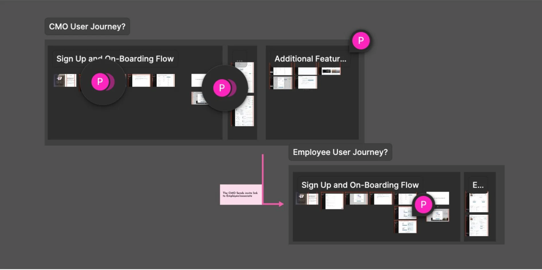
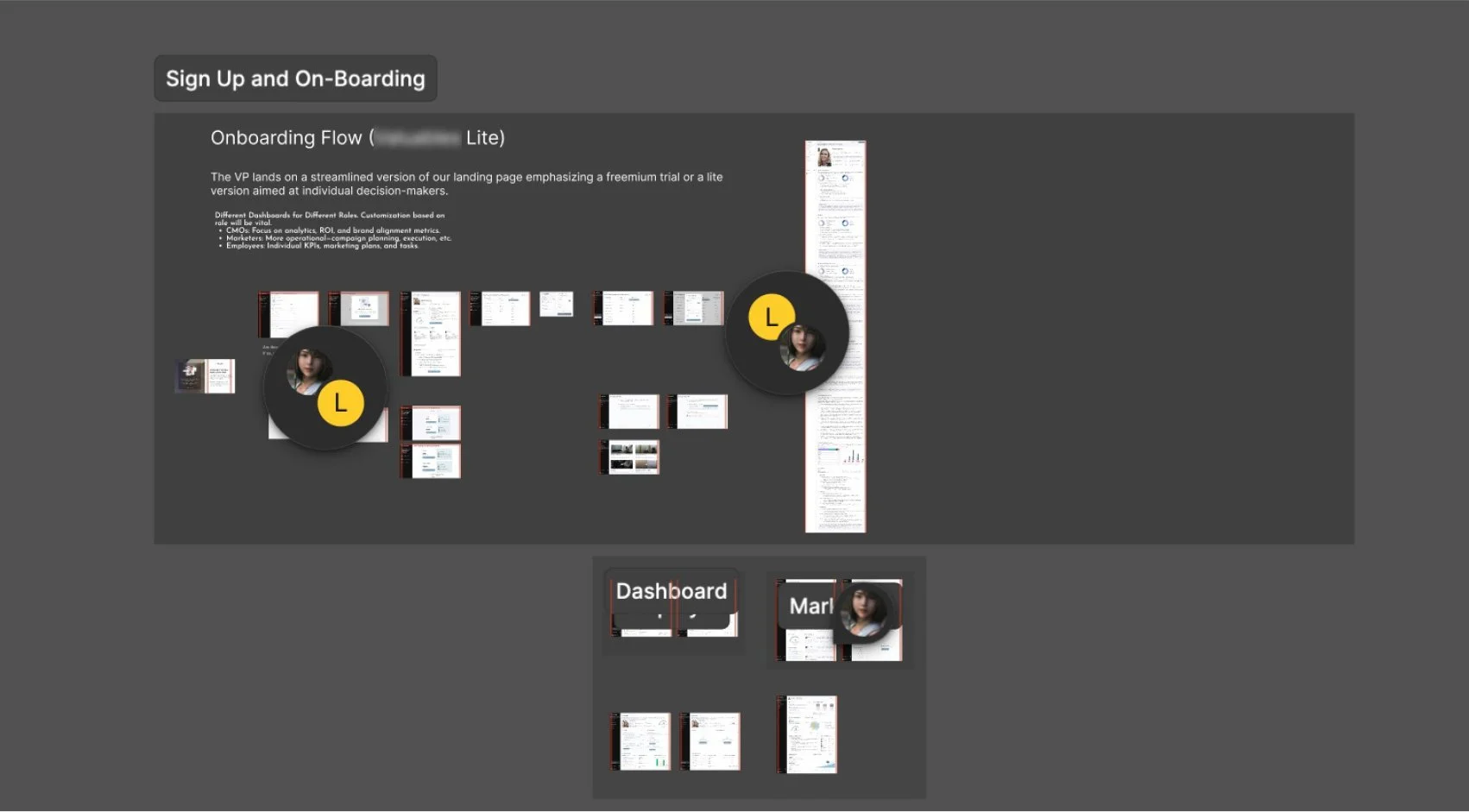
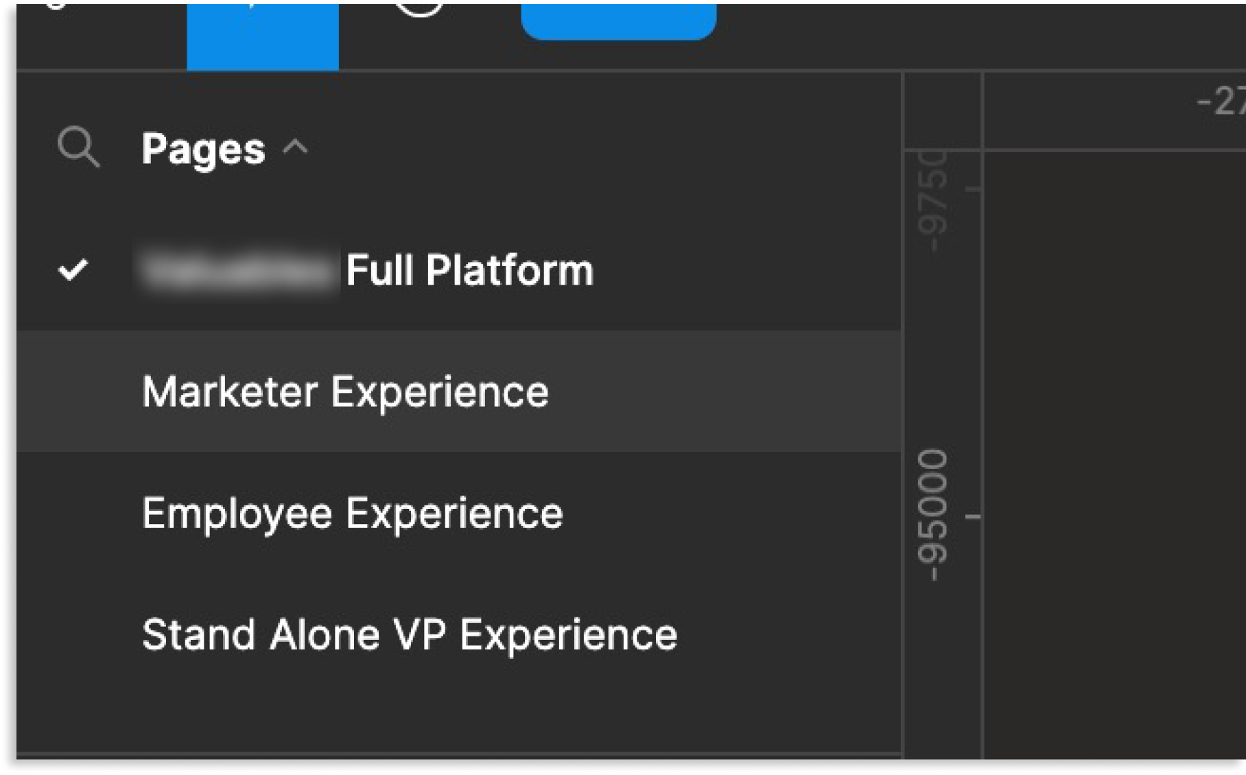
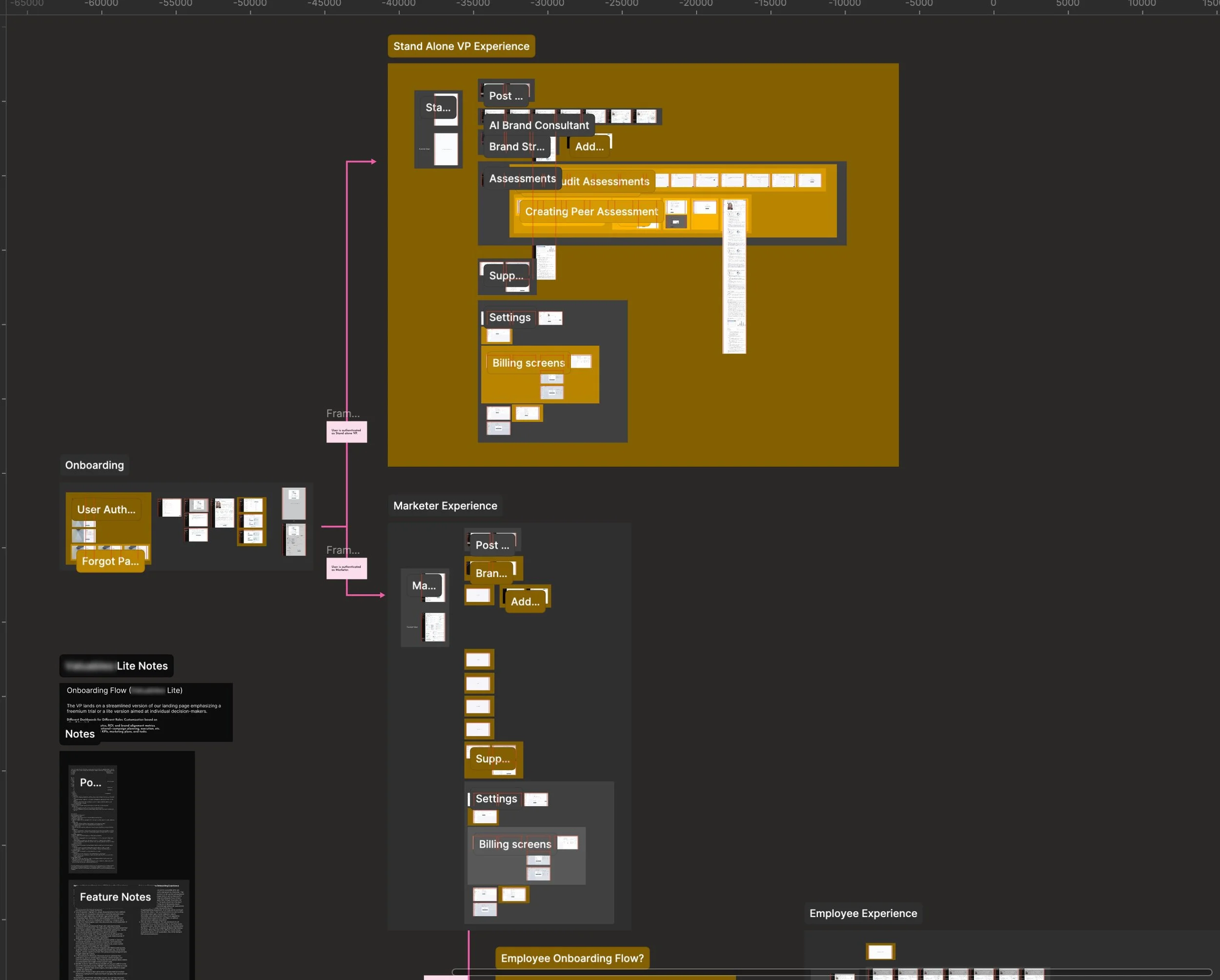
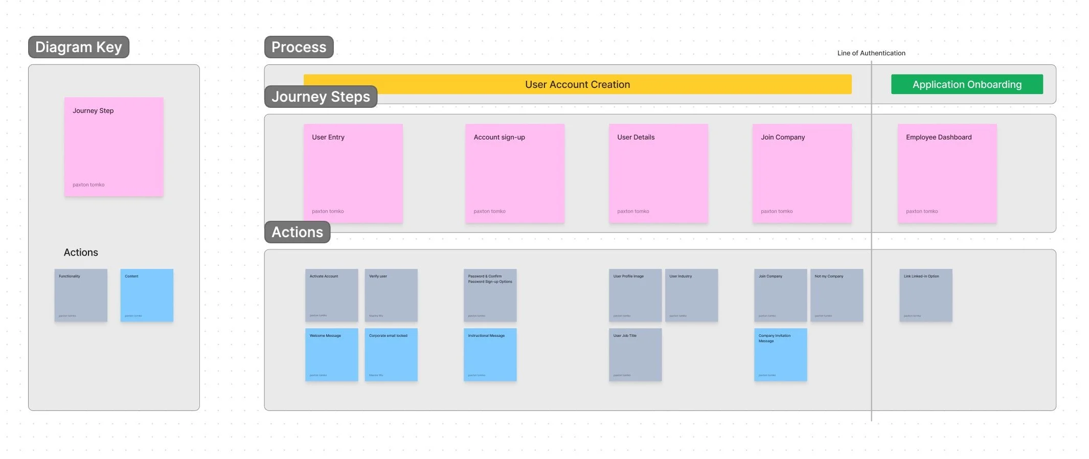
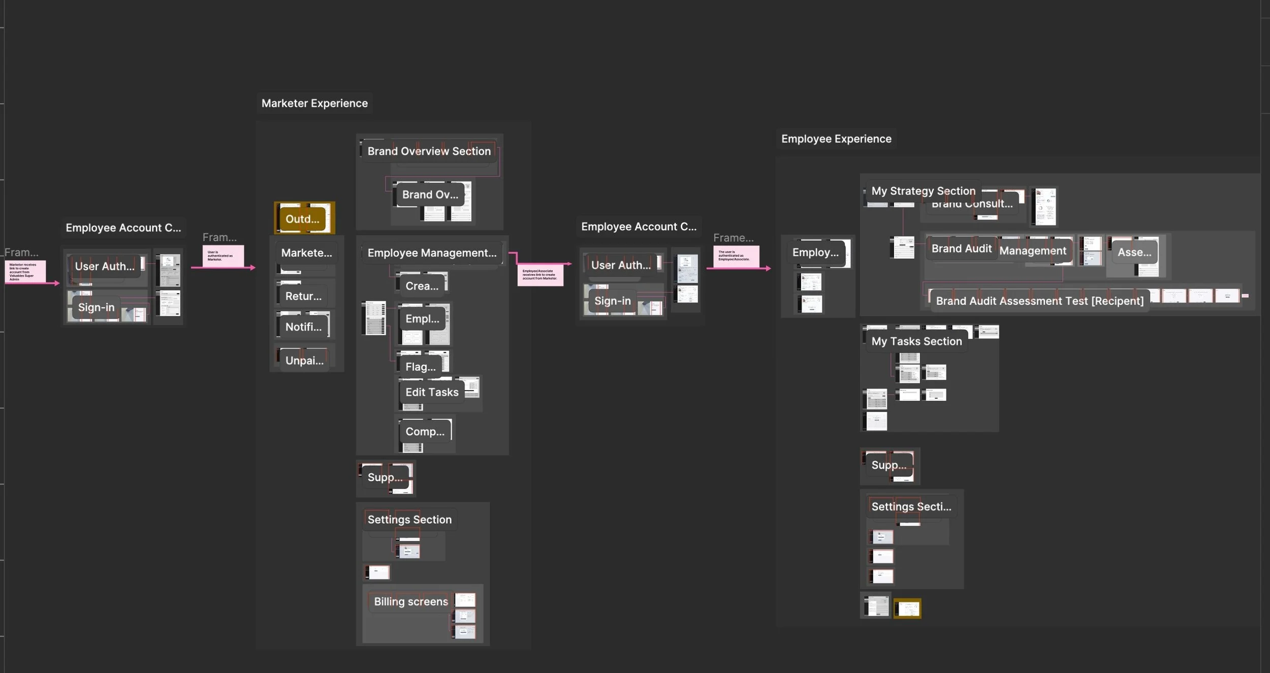
I then restructured the file pages to showcase the master architecture. As we had learned in our previous meeting with the client, the Platform aimed to appeal to marketers inside a company that needed to manage the company’s overall brand, as well as the personal brands of their employees. This insight meant the Platform would need a portal for the marketers, and as the client explained, they would be responsible for bringing on the employees who would need their own portal as well. I identified two variants of our user groups.
Architecture Discovery
Not only was the platform going to have two different user portals, one for each of the personas that were shared with us, but it might need a third portal for stand-alone users. This third user group would need to act like a hybrid, combining the features and architecture of the previous two portals.
We would have users in each persona group who would be using the platform for the first time, and of course, as users continued to use the platform, they would become returning users. Based on the discussions with the client, the architecture would have a single authentication flow that contained the onboarding process by which both user groups would use.
Architecture Cleanup
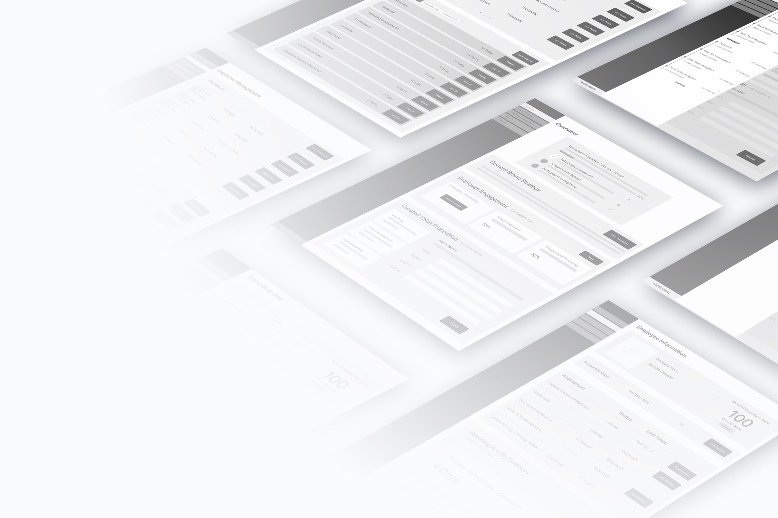
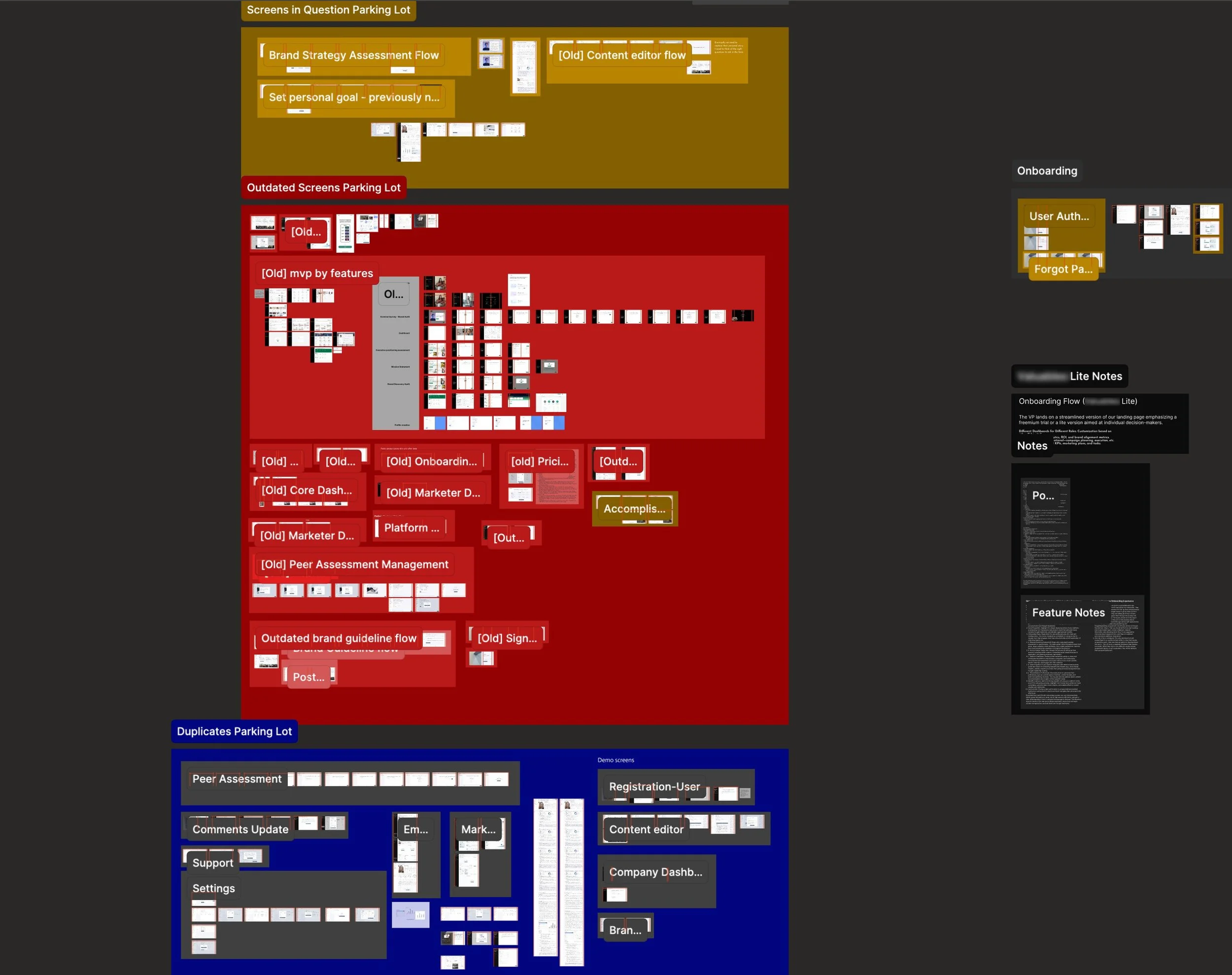
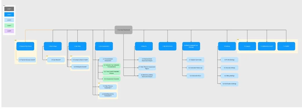
The first thing we dove into after our Document walkthrough with the client was building a system to organize the Figma document and the Platform’s architecture. I duplicated the document and created three parking lot sections to hold screens that are not in the current architecture: Duplicates, outdated, and screens in question. The information Architect and I then went through the document and started organizing the screens into a wireflow architecture based on the discussions in the document walkthrough meeting.
10/21
I worked with our architect to map out the wireflows for the marketer and the employee portals, the onboarding for new users, and how they all fit together. We then duplicated screens and added placeholders to mark what the stand-alone hybrid user portal might look like. Any screens we couldn’t fit into the wireflow architecture we added to the corresponding parking lot section. We also began to color-code the file to document sections of the architecture that were still in progress, and we had questions about. This method helped to call out architectural gaps and make the document more legible.

Sitemapping
As we worked through creating the wireflow architecture from the screens, I made a sitemap for all the portals: the marketer, employee, and stand-alone portal experiences. This helped us get a wide view of the page hierarchy to grasp our navigation pathways. I could then pass off the sitemap architecture to our researcher for later testing. We highlighted sections of the sitemap in yellow again to call out areas we had questions about or were uncertain of for further conversation with the client.
Version Control
While continuing to make sense of the architecture and clean up the Figma document, we used version control to make sure we didn’t loose anything and could undo any mistakes we might make while organizing.
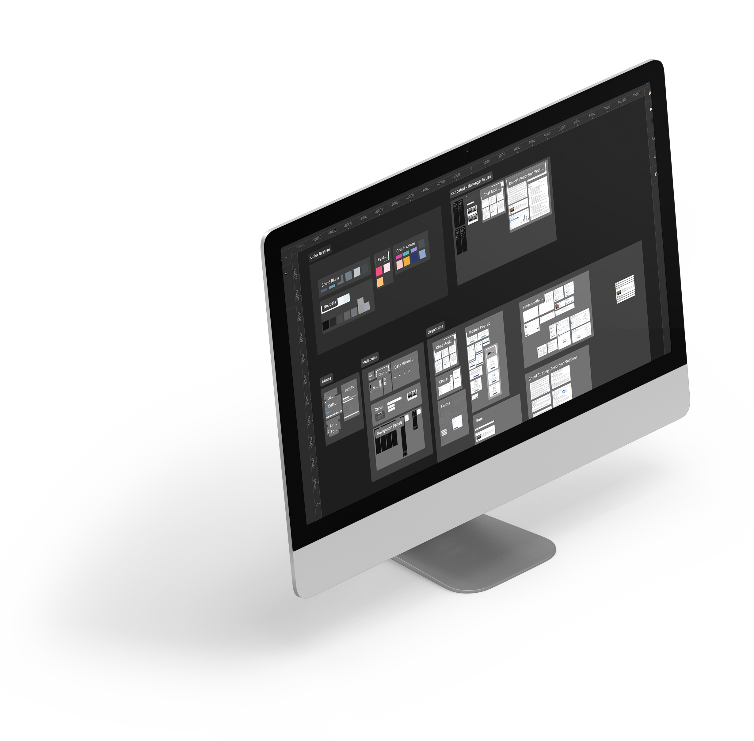
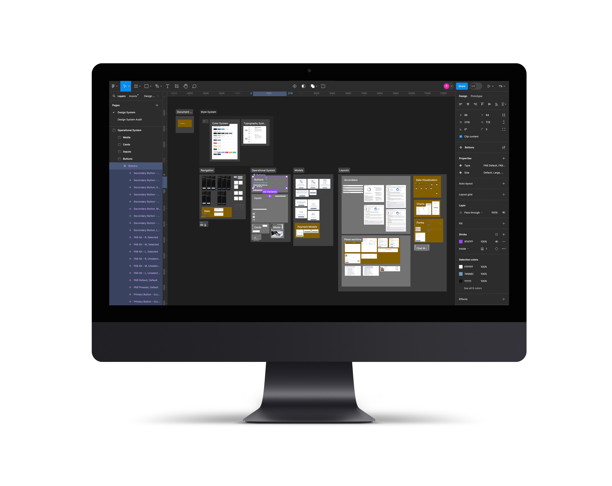
Design System Audit
As the information architect and I continued to map out the current platform architecture and clean up our working document, I conducted a design system audit. I documented every different color, typeface, and component I came across. I then organized and categorized them according to the atomic design theory. Lastly, I ran contrast checks across the designs to see how they performed compared to the WCAG guidelines. Doing this audit helped me to break the components down and get a better sense of the different features of the platform. It also gave an insight into some usability issues to address later on.
WCAG Contrast Guidelines
All text and graphics need to meet the AAA or AA standards in order to prevent usability issues.
Contrast Ratio
Normal Text
Large Text
Graphics

Defining the MVP


12/21
Understanding the Product
After assessing where we were and how much ambiguity we still had, I met with the team again to discuss moving forward. I proposed a three-perspective approach, to express our observations to the client. First, we needed to express what UI was present and what UI designs were missing. Next, we needed to express how these missing screens pointed to bigger architectural gaps. Lastly, we needed to open a dialogue about the platform’s strategy to educate ourselves further and ensure any designs to fill in the gaps were in line with the client’s vision and direction for the product.

Increased Strategy Sessions
In our next meeting, we presented the feature map to the client and allowed them to rearrange and clarify the current features of the platform. In our next meeting, we presented the feature map to the client and allowed them to rearrange and clarify the current features of the platform. As the screens were still presented in different UI design states, the discussion of MVP features became an ongoing conversation.
One of our biggest questions was around the capacity and functionality of a feature the client called the Brand Consultant. This feature leveraged AI to help users manage their brand and suggest ways they could improve it. We were struggling to understand the scope of this feature. It was designed in only a few locations and seemed to be a possible usability issue in the way the interaction was designed.
Content Audit
While working on our Heuristic Analysis, our team's information architect and I collaborated to document the content we found across the platform. We grouped these to help backward map the application's features as a starting point for any conversation about strategy. As there was still a fair amount of ambiguity, I wanted to bring these questions and observations to the client to help open a dialogue on the strategy and gain a better understanding of their view and vision about the MVP’s features.
Kano Analysis
I worked with our design researcher to have her conduct a Kano analysis of the features we could discover from the content and design system audits. This way, we could have a more strategic conversation with the client regarding the scope and features of the MVP. This way, we could have a more strategic conversation with the client regarding the scope and features of the MVP.
Leaving the meeting, I felt we were on a better path with the client. This meeting allowed us to establish more of a regular cadence for strategy meetings like this one that acted almost like a design sprint. Even though we felt the time pressure, knowing there was still a lot of work to do, the team felt more confident in our direction.
13/21
Bridging Gaps in Communication
As we continued in the project, using strategy meetings to carve out the current MVP architecture further while trying to marry that with the client's vision, we occasionally had difficulty speaking the same language as the client. In one of our daily stand-up meetings, I discussed with the team different ways we could better bridge our communication gap with the client. We came up with using lightning demos as a communication bridge. Moving forward, this became a huge help in our ability to communicate more effectively and massively helped us strategize collaboratively with our client. It gave us visuals for our team and the client to easily talk over things without needing to be as precisely articulate.
As our researcher conducted research inspiration for our lightning demos, I asked if she could also conduct competitive research now that we had a better understanding of our platform’s features. This way, we could better understand the platform’s positioning amidst similar platforms and help to further identify our core features.
Lightning Demos
This was a method of collecting different sources of visual inspiration, whether from competitors or simply other applications. We aimed to research components, features, or architecture patterns they used to solve similar problems to the ones we were facing. While our information architect and I occasionally assisted in this task, it was primarily led by our team's researcher.

Defining the Current Architecture
We continued to iterate on the architecture and clean up the document as we went along. Based on discussions with our client and the team, It appeared we had successfully mapped out the platform's current architecture through wireflows of high-fidelity screens and sitemaps. Our researcher used optimal sort to conduct a tree test to see issues we had with the existing architecture. Optimal Workshop allowed her to source participants directly through their recruitment pool using the template screener survey she built earlier.
Concept Testing
While our Researcher was conducting the tree test, I also tasked her with running an impression test. One of our concerns was whether users would be able to understand the brand consultant feature and how it worked. The impression test helped us better understand user's perceptions, validate some of our concerns, and understand if the MVP was moving in the right direction.
15/21
16/21

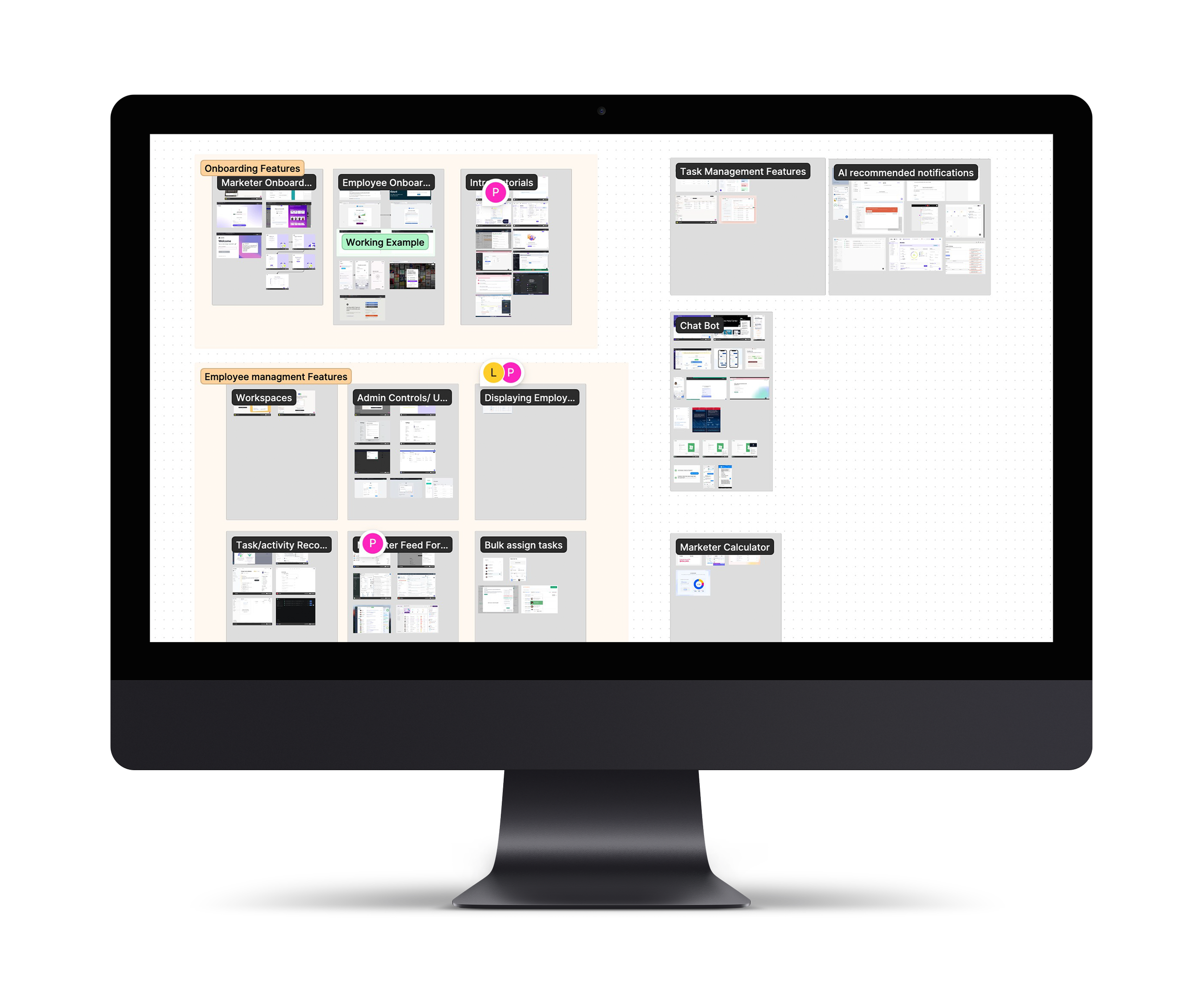
Defining Core features of the MVP
As we met with the client and continued to help strategize. A significant central question at the platform's core still dealt with understanding what the brand consultant feature was and should be.
Was our platform a brand management platform with AI assistive features, or was our platform an information platform powered by AI?
As we clarified the existing platform architecture and continued to discuss the application's core features, we went back and forth, trying to figure this question out. We continued to use lightning demos to discuss different functionality and features of the brand consultant. We also used the Kano analysis method to help us discuss what functionality of the brand consultant should be available in the MVP and what should be implemented later. As we discussed the issues and strategy further, the client talked through some of her expert and user interviews and the user stories that were central to the platform. These stories revolved mainly around marketers' ability to manage company employees' activities and tasks in their personal branding efforts. As we left this meeting, it was clear that we were a branding management platform with a unique selling proposition of AI assistive features.

Writing Research Plans
The team and I were concerned about whether we were moving in the right direction with our strategy or not. I knew we needed more insight into our user groups' day-to-day operations to understand better their pain points and goals as well as how to optimize the user flows. Our researcher shared this view and suggested it would be good to learn more about their challenges and help validate some assumptions about their needs and preferences. As we knew the client was on a tight deadline, it was apparent that their primary focus was creating this MVP to pilot test with select companies. They agreed the research would be helpful but were worried about wasting time on it, as they didn’t know how to. We ended up not having the time or the budget to conduct the research we hoped to, but I ensured the client wasn't left hanging after our time was concluded with them.
Diary Studies
Our researcher drafted up a research plan and an interview questionnaire template for the client to conduct a diary study along with a research plan for further usability and concept testing. She also compiled a list of the respondents she had found through our screener survey she had drafted and sent out.
Filling the Gaps
Iterating the Architecture
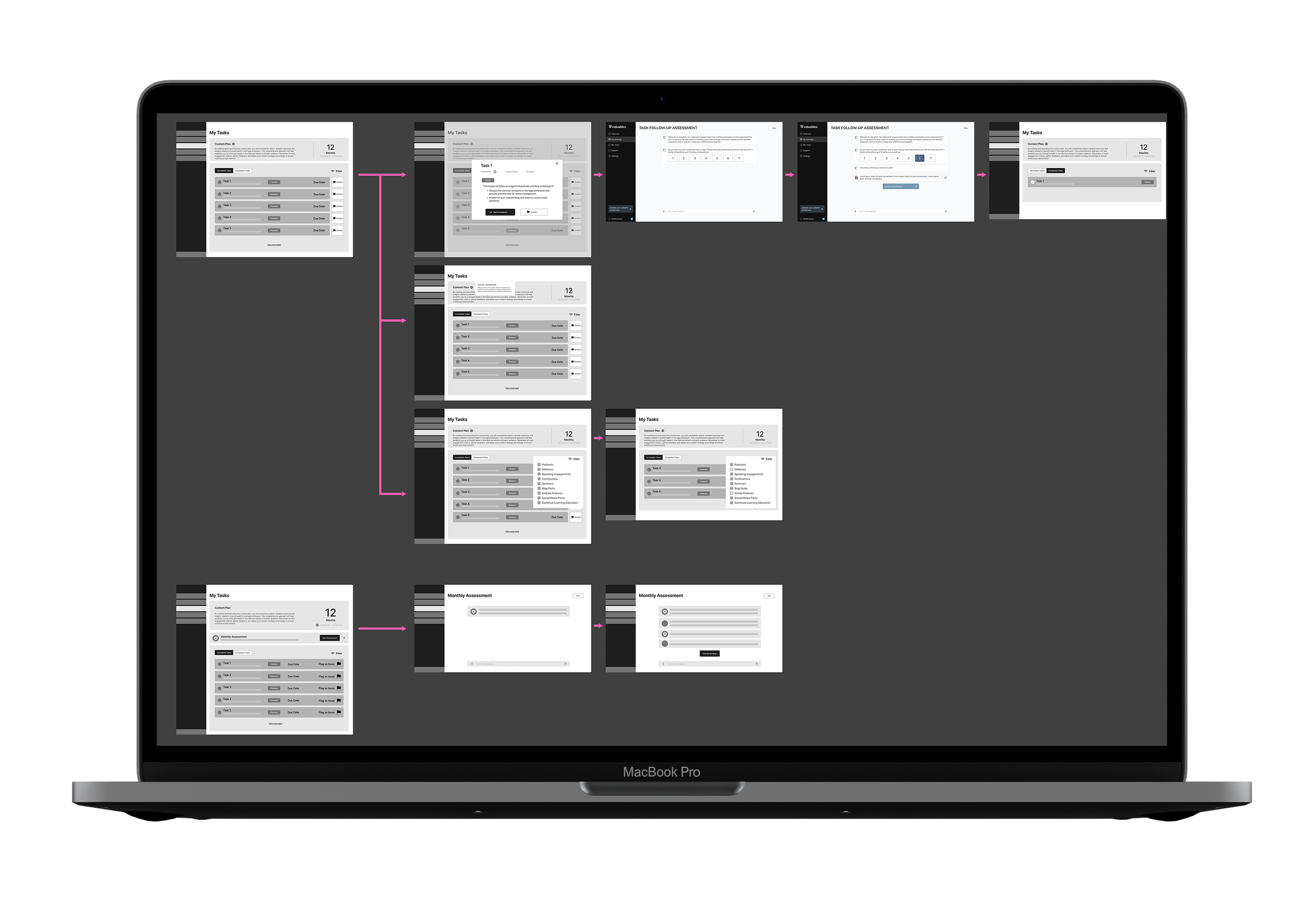
With greater clarity as to the platform's purpose & vision, I had stronger confidence in our team's ability to help design the missing gaps in the architecture. With our deadline coming soon, I communicated with the client and set up strategy meetings every few days. Our design researcher worked on conducting a card sort test to gauge users' mental models. Looking over the MVP architecture, we had three main gaps.
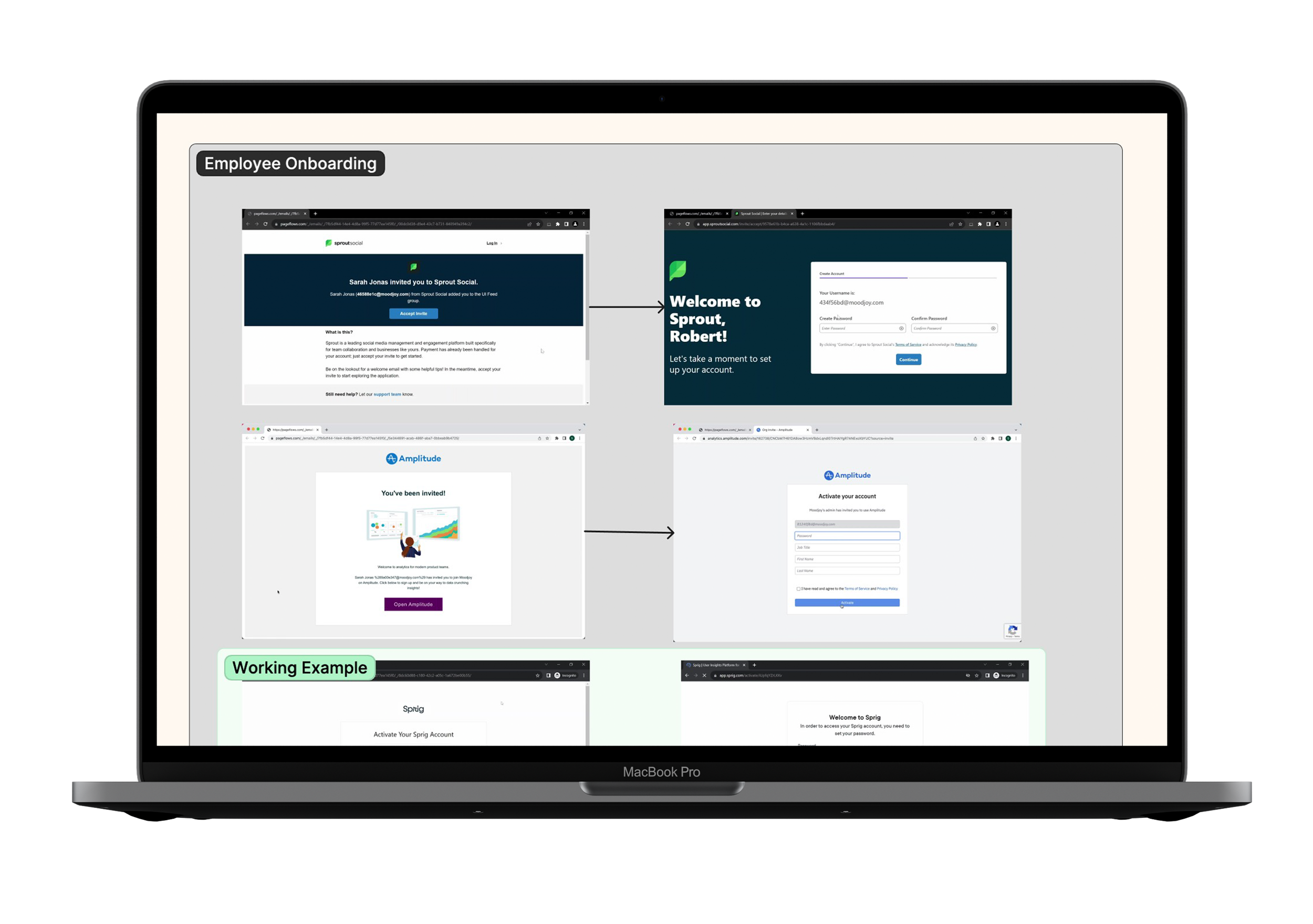
Onboarding
We needed to update the user authentication and onboarding flows.
Looking over our project timeline, I knew we wouldn't have the time to finish designing the MVP gaps in high fidelity, but I wanted to make sure our work wouldn’t be useless to the client and that they would be able to work on it after our time with them. I proposed that our team update the existing screens to fit the new architecture and use low-fidelity wireframes to fill the architectural gaps. This plan would provide the client's in-house UI designer with the information needed to design high-fidelity designs after we had left and pass them off to development. I suggested my information architect work on the low-fidelity designs while I worked on updating the High-fidelity screens. After working on the high-fidelity screens, I shifted my focus to helping with the low-fidelity screens and wireflows.
Designing the Gaps
Employee Management
The marketer portal required the ability and section to manage employees
One section of the platform's architecture that was an ongoing conversation was its user authentication and onboarding. The client wasn't sure what to do with it. The business plan for onboarding users was also under decision and was changed a few times. To start, the marketer user would need to sign up and authenticate independently, while the employee required access from the Marketer. I noticed a few problems, but chief among them was that each user type had different needs and information. Despite this, our client was keen to keep a single standard authentication process for both user groups.

Task Management
The employee portal required the ability and section to manage their tasks
Updating the UI
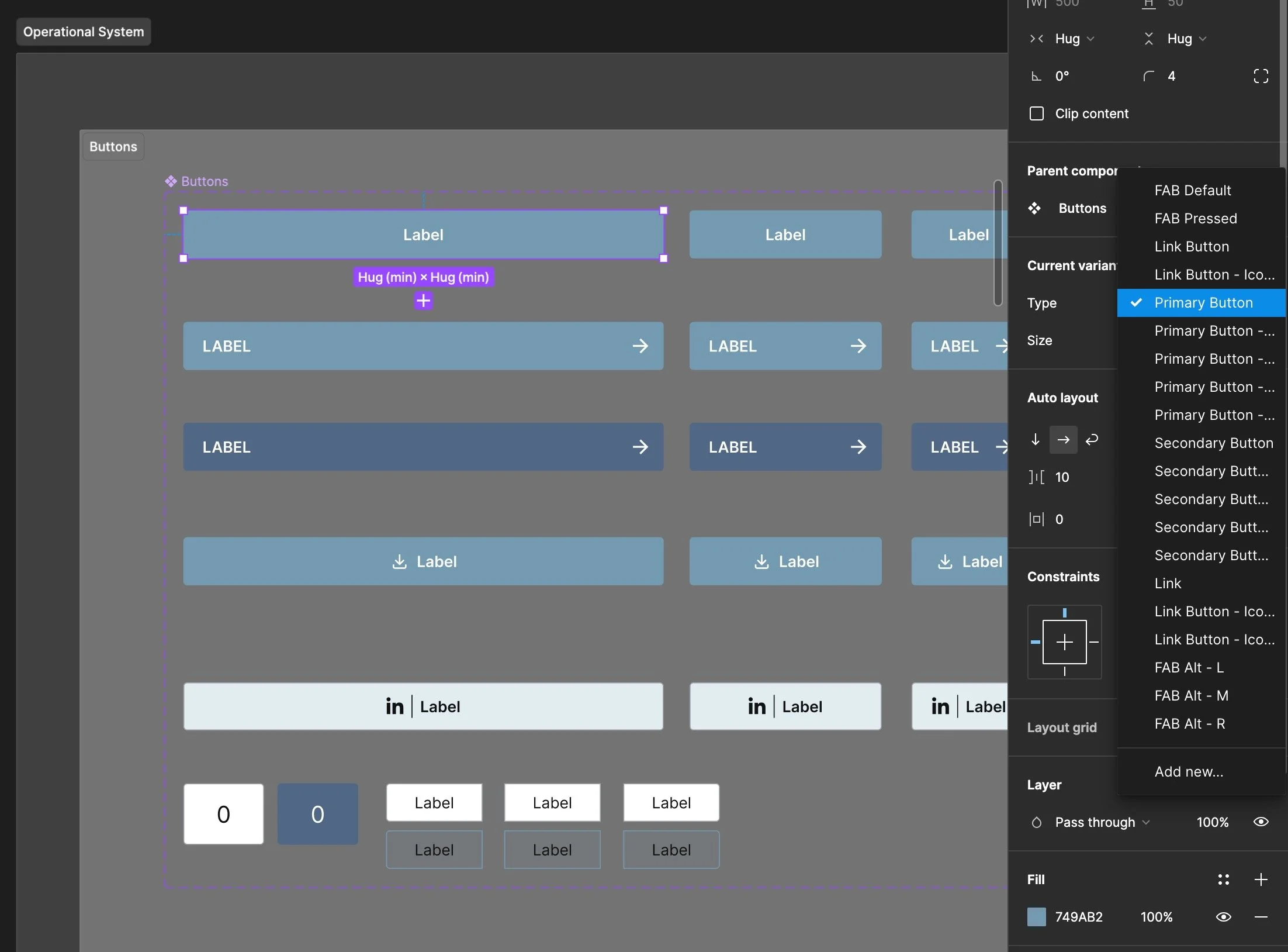
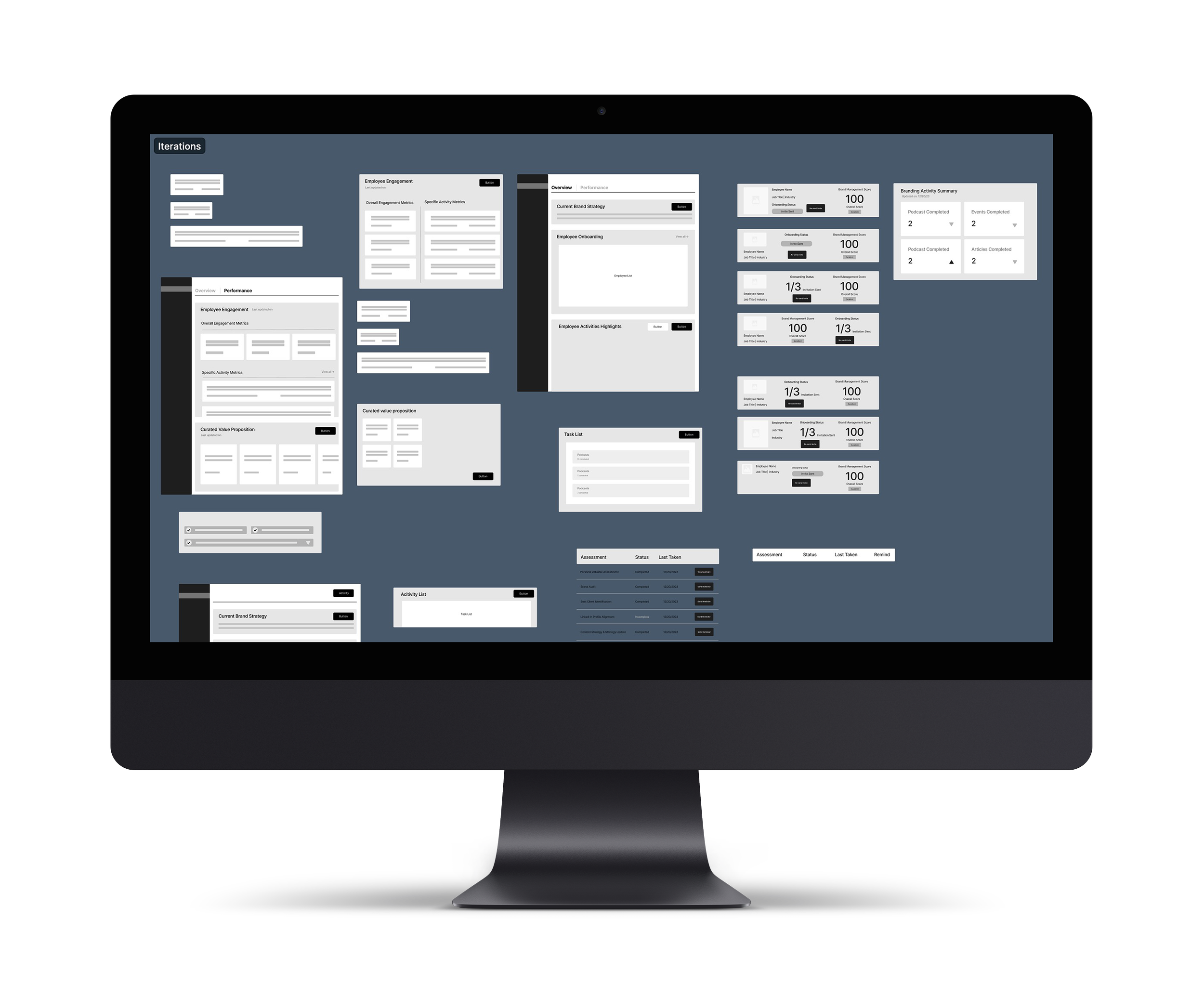
I knew the typography was outdated and needed to be updated across all the platform screens and that components might still change as we iterated. The components on the screens were not componentized, which would cause hours of tedious rework if there were any minor updates we might have to continue to make. I began creating a component kit and organizing the visual elements into a simple design system. I standardized a color system for the platform based on the existing brand colors and additional colors used. I also adjusted the color system to abide by WCAG contrast guidelines to fix usability issues. I then created the components in sets to be responsive and include different states, such as pressed or inactive, as needed. I updated the typefaces used as I created the component kit to be the new brand typefaces. This simple design system and component kit would help me quickly work and make changes across the platform. After the project was over, I knew it would be an added benefit for the client, as they could reuse and add to it later on. In implementing the new design system, I leveraged the adjustments in the platform's architecture in combination with layout and component choices to reduce information overload on the screens, helping to make the interface more intuitive.
Our Information Architect and I proposed redesigning the user authentication flow for each portal to allow the onboarding steps to be handled inside the user account. We used a tutorial walkthrough and a series of pop-up models to help onboard first-time users to the platform. This onboarding would keep users in a flow and allow new users to authenticate quicker as they learn the platform through action. After the user completes the onboarding tutorial steps, it will disappear to declutter the interface for the now-returning user moving forward.
User Journey
One of the client's main concerns was allowing users to get into the platform as quickly and painlessly as possible under security constraints. The current designs forced all user types through a single onboarding process that required them to complete an extensive form completion process. Our team collaborated with the client and mapped out the user journey for each user persona using Figjam to identify the steps and user actions. This allowed us to standardize an authentication flow for both user groups.
17/21
19/21

With the card sort data collected, lightning demos, and user stories we continued to discuss with the client throughout the project, our information architect and I worked together in a sprint-like fashion to ideate low-fidelity wireframes. We again began in Figjam to map out the user journey and actions to better understand what content and functionality the user would need to accomplish their goals. Again, we worked hand in hand, ideating and iterating low-fidelity wireframes that we compiled into a single wireflow diagram. Would then meet with the client to review the wireflows and ensure the designs and features aligned with our new understanding of the platform’s core being a branding management application.
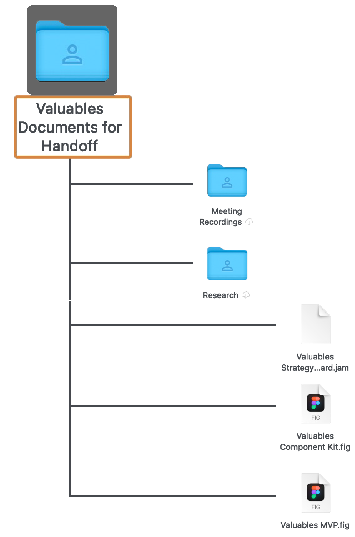

Design Handoff
With the architecture correctly accounted for and the gaps filled in, we came to our project's end with a fully ideated MVP concept. As our final deliverables for the project, we handed off the master architecture of the MVP with updated high-fidelity screens, a design system with a component kit, our whiteboard strategy sessions, additional research plans, and a research roadmap to help guide the client moving forward. I compiled all these documents in a Google Drive for easy handoff.
Knowledge Transfer
I set up a meeting with our team and the client to walk them through the Google Drive folder and documents. We made sure to talk through each document and answer any questions the client might have.
Red Routes
Knowing that users would frequently be navigating these pathways, we wanted to ensure they used a structure that felt familiar to them and was easy to navigate forwards and backward. We designed both red routes for the marketer and employee portals in a hierarchical structure with sequential user flow structures branching off.
20/21
Retrospective
Key Takeaways
This project was a fast-paced and winding challenge, but in reflection, I was most struck by how I defined success. Finding success in a project is not simply about designing solutions for users. While this is still vital, learning what is of value to the clients and business is vital. It’s easy to get caught up with design theory and ideals of what you strive to create and ignore that the client or business is just like our users; they have needs and goals of their own. Finding ways of being in communication and bridging gaps in translation is essential to creating alignment with the business and leading the product's vision forward. Helping our client organize their architecture and make sense of their MVP was of immense value to them and allowed us as a team to positively impact their progress and move them forward.

Next Steps
Moving forward, if I were to continue working on the platform, I would have liked our team to conduct more research about the platform. The business and our team could have benefitted from more concept validation research. While the impression test data showed users responded positively to the platform concept, it was preliminary. I would have liked to conduct more user interviews to validate the MVP concept’s desirability and usefulness further. I would have continued by carrying the low-fidelity screens we designed into the high-fidelity stage, applying the design system. Afterward, I would have created prototypes of the platform’s red routes to conduct usability testing before the client’s pilot testing.
21/21

Thank You!
Thank you for reading this far, and thank you to my team and client for the insights, collaboration, and diligence they displayed on the project! Feel free to explore some of the other projects I've undertaken below.

