


Defining User Value
Objective
01/20
02/20
Managing all the different responsibilities and aspects of our lives can be daunting and overwhelming, especially for those with ADHD. These life responsibilities can hold people with ADHD back from reaching their potential and the life they want, despite how capable they might otherwise be. The subject of ADHD and its effects has been a subject of personal interest for me, and I wanted to create an application tailored to the needs of individuals with ADHD. I set myself the challenge of designing an MVP solution with a timeline of 3 months to design and test. The objective was to design a solution to help people with ADHD organize themselves and plan their day.
Project Planning
Role - Product management, UX research, Interaction & UI Designer
Timeline - 3 Months
Skillsets - Strategy, Research, Information Architecture & UI Design
Tools - Figma, Asana, Figjam, Notion, Slack, Google Sheets, Google Docs, and Google Drive
When I started the project, I had a lot of questions and a lot of gaps in my knowledge. While I had some previous knowledge of ADHD, I wasn’t sure how accurate that knowledge was. I started by creating a research plan to uncover what information I knew I would need to know. My first objective was to learn more about what ADHD is, compared to what I thought it was, and how it can affect people. This was where I began with secondary research.

Measuring The Market
All of this information helped me to build a frame for understanding ADHD, but I also was worried if there would be a large enough market out there for the product I planned to build. I looked into statistics on people with ADHD and found that, according to the American Academy of Pediatrics, Attention-deficit/hyperactivity disorder (ADHD) is the most common behavioral condition and the second most common chronic illness in children. “National survey data from 2016 revealed that 9.4% of US children received an ADHD diagnosis at some point and that 8.4% currently had ADHD. It is now recognized as a lifelong disorder and remains one of the most extensively studied and yet highly controversial conditions (Pediatrics October 2019).” In exploring ADHD in the adult demographics, I learned that the worldwide prevalence of adult ADHD is estimated at 2.5% (Royal College of Psychiatrists, 2009).
03/20
Generative Research
I searched for various reputable sources and articles on ADHD to help me define the disorder better. I probed through social media to uncover thought leaders or influencers who were talking about personal experiences with ADHD to get a glimpse into the experience of living with the disorder. While conducting this research on ADHD, I discovered a key understanding of ADHD and how the disorder disrupts a person's executive functions, causing them to be dysfunctional (DSM 5 ADHD Thomas E Brown, Ph.D.). Executive dysfunction is a term used to describe faults or weaknesses in the cognitive process that organizes thoughts and activities, prioritizes tasks, manages time efficiently, and makes decisions. Up until this discovery, I thought ADHD affected people the same way I think a lot of people misunderstand it, which is that they believe ADHD is characterized by the behaviors of being unable to focus or defiance of authority rather than the root causes of executive dysfunction. As I conducted this research, I took notes about my target audience and continued to revise them as I learned more.


Categorizing ADHD
According to the American Psychological Association’s DSM-5, It classified ADHD into three categories: Inattentive type, Hyperactive type, and Combination type ADHD. It was reclassified in the DSM-5 (the most recent edition) and now includes these three categories, where Inattentive type was previously called Attention Deficit Disorder (ADD). ADHD is considered to be a neurodevelopmental disorder (Weiner, L., Perroud, N., & Weibel, S. 2019) that causes impairment of functionality. Since it’s considered a neurodevelopmental disorder “ADHD may also co-exist with other mental health conditions, such as oppositional defiant disorder or conduct disorder, anxiety disorders, and learning disorders (Austerman, 2015)”.
04/20
Competitive Research
While conducting generative research, I wanted to know what applications might be out there that people could use to help them plan their responsibilities. I was leaning towards designing a mobile app or possibly a watch app and decided to explore these types of applications. I found multiple applications, from calendars to task managers, time block scheduling software, note taking, Pomodoro timers, and even project management software. Since my problem was more personal, I could reason that applications like project management software would not be a competition. I would be looking for applications that are aimed at individuals. The applications that seemed to be my potential biggest competition to focus on were, Todist, Sunsama, and Moleskine’s Day planner app. Each app had a slightly different feature set but aimed to address day planning and managing an individual’s responsibility while being a leader in their niche.


Sunsama
Sunsama was the only productivity application I found that was branded specifically at people with ADHD. Its core features revolved around combining task management features with a calendar so people could schedule their tasks and integrate their calendars to get a single view of their time.
Moleskine Day Planner
Moleskine’s day planner app is designed to be a leading calendar application. It provides users with the features of a clean UI where they can integrate all their calendars into a single view to easily manage their time.
Todoist
This application aims to be one of the industry's best task management software for personal use. It provides users with the features to create and manage tasks they need to complete.
Usability Catastrophe
Major Usability Issue
Cosmetic Problem Only


Minor Usability Issue
Not An Issue
I conducted a Heuristic Evaluation and a SWOT analysis of each app to see their strengths and weaknesses, along with what opportunities were present for my solution. After capturing screenshots and analyzing the applications to benchmark the competition, I started to get a sense of the market standards. Benchmarking these competitors also helped me to see what design patterns were commonly used in the niche, and start getting inspiration for further sketches or ideas I might be able to design for my product.
05/20
06/20
Primary Research Planning
When I finished conducting generative & Competitive research, I set out to better understand the personal experiences of people who live with ADHD. To get a solid sense of what strategy to start working towards for my MVP, I needed to understand how an application might be of value to people in my target audience. It seemed reasonable to me that a specialized productivity application would be of value to my audience as it could help them tangibly manage their executive function issues affected by their ADHD. I had two primary questions.
To find answers, I decided that I would use screener surveys to find participants in my target audience I could interview to learn more about the first-hand struggles of ADHD. I would then conduct a diary study to understand their pain points, their behavior toward life management, their planning habits, and their daily routines. Last, I knew I would have to conduct usability tests with low and high-fidelity prototypes after I created a solution to verify if the ideas I had come up with were valuable to the target audience.


Screener Survey & Interviews
I reviewed my research notes and started identifying the target audience I would look to talk with. While my generative research showed that ADHD symptoms can decrease with age, it can be persistent throughout a person’s life and doesn’t always decrease. I figured that my target audience should be teens and adults who live in the US, in the age range of 18-65. These people would be most likely to have personal and work or school responsibilities they would likely struggle with managing. I also knew that my audience would need to be people who cared about self-improvement as well as have been diagnosed with any of the three forms of ADHD.
What methods do people with ADHD use to manage their time, workload, and attention during their day?
What obstacles or needs do they encounter while trying to manage and plan their day?
Since I was leaning towards creating a mobile app, I knew my participants would need to own and be able to operate a smartphone. I set up a project in User Interviews and created a screener survey to recruit and meet with participants. After selecting participants discovered from my survey screener, I conducted one-on-one interviews that lasted roughly 45 minutes to an hour. These interviews helped me to understand better the difficulties of people with ADHD and how they currently manage it.
Diary Studies
At the end of conducting the interviews, I asked the participants if they would be willing to join a diary study to help me better learn about the methods, workflows, routines, and how they use different tools to help them plan their day. While most agreed to join the study, a few dropped out or didn’t respond when the study began. This setback was a challenge I hadn’t fully anticipated. In hindsight, I should have realized this might happen. Luckily, I was still able to find users through my open study in User Interviews, which made it easy.
I asked participants to fill out a diary entry I created in Google Forms for four days throughout the week. I then sent the diary entries daily and a check-in email every other day to follow up with participants throughout the week. The check-in emails served as a point to remind participants to fill out their diary entries and as an opportunity for the participants to raise any concerns or ask any questions.


07/20


Additional Insight 1
Flexibility was something important for our audience as well. I came to realize that it went hand in hand with limiting distractions. If a participant had to fight with how something worked, they could quickly become distracted after or in the process and forget what they were trying to accomplish in the first place.

Synthesizing Insights
08/20
At this point, I had conducted a fair amount of generative and primary research and discovered much about my problem space and target audience. But my discoveries were still a bunch of loose information. I needed a way to synthesize this research into meaningful insights. I began by creating User Personas and empathy maps to get a better view of who my users were and understand their perspectives. While analyzing my audience, I began affinity mapping. Using Miro, I collected important discoveries, quotes from interviews, and other information from my research on sticky notes. I then began to group the sticky notes with similar notes to uncover common themes. Two groups emerged from my affinity maps, with a few subgroups of insights. The first group was obstacles and difficulties, and the second was planning processes and participants' workflows.

Miriam
“So like the second that something flies into my brain, like ‘you need to call this person tomorrow’ I’ll write a thing on Google Calendar for it.”
The biggest obstacles and struggles I found that people with ADHD struggled with were forgetfulness, distractions, and procrastination. They often had to use multiple tools to manage these issues, the most common being a Calendar app. Most, if not all, of the audience, admitted struggling with being distracted often, saying that they were primarily visually sensitive. Even the smallest things could derail their thought process and they would have to spend considerable mental effort to refocus on what they were doing. Participants said sometimes they wouldn’t be able to refocus and would forget what they were doing and go on to do something else. One important insight I found was how multiple participants explained that to cope with their forgetfulness, they needed to document it immediately when it came to mind, or they would forget it and never remember it. This forgetfulness would cause issues in multiple areas of their life as they would miss out on plans or responsibilities they needed to complete. Along with this insight, almost every participant mentioned they needed to set multiple alarms on their phone to remember when to do things.
David
"I always have my notes, uh… in all my devices. In my phone, tablet. And I… as soon as I know about a meeting, I set up reminders. Like I take care of things right away because if not… uh I, I get lost.”
Ivan
"Very frequently I know what I need to do, but they're just this… it's just disassociated from them, from the mindset of doing them at that moment."
Additional Insight 2
I discovered that the ability to prioritize and create a sense of flow or a system was important to our audience managing their ADHD. This sense of flow helped them to minimize distractions and kept them on task. If the sense of flow was broken, they’d easily forget what they were trying to do and be distracted by something else.


Defining User Value
Once I had the user personas and empathy maps, I had a better sense of who I would be designing for. But I still wasn’t sure what I needed to design. I brainstormed a list of How Might We questions (HMWs) as a way to reframe the issues I had come across. Then, I began to use sticky notes in Miro and write a list of User stories to map out and plan what features the application would need to provide value and help address the issues faced by my target audience. This list became a fairly large list of user stories. I knew I would have to start with a Minimum Viable Product (MVP) to test first, so I reviewed my user stories again and pulled out only the features I saw as the core solution. I grouped these stories and determined that my MVP would be a knowledge management application aimed at helping users record and break down information into actions they could then schedule and complete.
MVP Core Features
After synthesizing my research and looking over my user personas, I noticed that it was common for users to use multiple different applications or tools to help them manage their problems caused by executive dysfunction. On top of that, each of the application’s Interfaces wasn’t specifically designed to be easy for people with ADHD to use. These observations led me to decide that the core features of my MVP needed to include Notes, Tasks, and Scheduling.
Ideation

11/20
Sketches
Sketching became one of the most fun parts of this project for me. I was excited to get into the details and work out how this application might work and feel. I began by brainstorming potential pages, page hierarchies, and concepts of the app’s core features. During my research, I discovered a common method participants would use to manage racing thoughts was journaling.

Building the Architecture
I wasn’t sure how my target audience would best be able to navigate through my solution concept. Before designing the architecture, I used Optimal Workshop to run a closed card sort test to understand how participants grouped information. Based on the card sort responses, I then used Miro to create a sitemap of the pages I knew I’d need. This sitemap gave me an overall structure of how the core screens would fit together and help me identify the core pathways my users would be navigating. Based on the goals of my user personas, I could inductively reason three red routes of the application and again used Miro to create user flows.
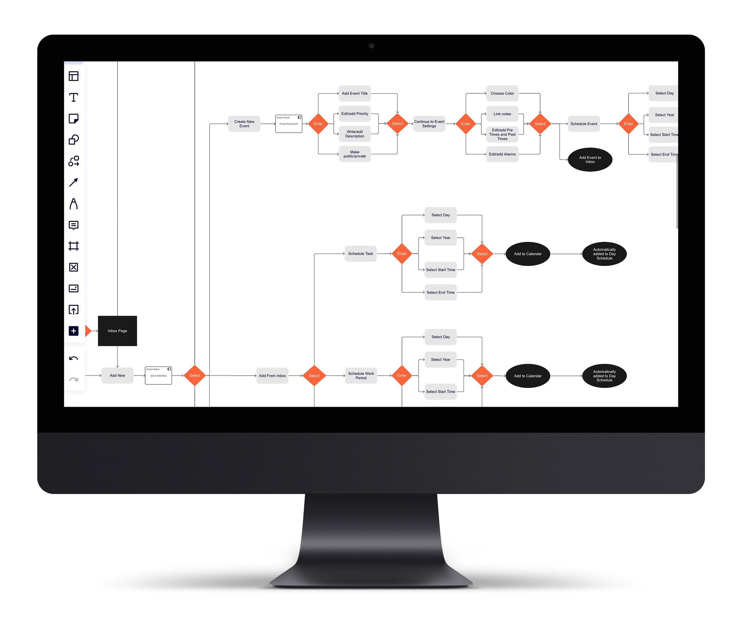
User Flows
I user flow diagramed the red routes of the application to ideate the core interactions and focus on error prevention. I used Black boxes to represent the screens, grey boxes to represent process steps, and orange diamonds to showcase decisions. I mapped out the flow for a users authentication into the app, the navigation of the calendar/schedule, and the pathways for creating new actions. By focusing on the steps and logic of the experience, I could iteratively design the flow to be efficient, leading to a usable and hopefully enjoyable experience for my users.
Melanie
“Procrastination and initiation of tasks are probably the hardest pieces to manage in my entire life”.
Bruce
"Starting is the hardest thing. I often find it difficult to break down tasks… Very frequently I know what I need to do, but, it's just disassociated from the mindset of doing them at that moment.”

I brainstormed a feature that allowed people to create a note to help them clear their cluttered minds and then create tasks or events from inside the note. As I worked through these sketches, I solidified the decision of the solution being a mobile application focused on the day’s schedule. Since mobile applications would be easily accessible and almost always present with potential users, this seemed to make the most sense for the MVP. The focus on the day schedule would allow users to immediatly see what they needed to do and when. The rest of the application would allow users to update and manage their schedules with different features such as notes, tasks, events, and custom time blocks.


Designing the Skeleton
With the information architecture worked out, I began to wireframe out the screens for each of the red routes in Miro. I then used the Wireframes to create Wireflows to visualize the user flows from an experiential perspective. This process helped me work out the components I would need to create for the application and also helped me to make sure my user flows made sense and didn’t have any glaring issues. I wish I could say this was a straightforward process, but instead, it was more iterative. I began to notice gaps and areas of improvement in the user flows when I created the wireflows, which I could go back and improve upon in the user flow diagram.
10/20
13/20

Moodboarding
While designing the information architecture and the wireframes of the application, I took the time to do some visual research. I gathered different sources of inspiration to help me define an aesthetic and feel to the application. My research had shown that people with ADHD were very easily visually stimulated. This visual sensitivity could quickly lead them to be distracted. I decided to focus on creating a brutalist aesthetic. I also wanted to express the sense of empowerment and flow the app would provide users. I used Milanote to curate my inspiration into a moodboard and take notes on the elements I felt expressed these qualities.
Prototyping the MVP
Design System
I started building my high-fidelity wireframes and prototypes by creating a design system in Figma. The design system would help me save time in the long run. I reviewed my research and my mood board and determined my design system should have three core principles that govern it. I used a premade Icon library called Clarity, which fit the app’s aesthetic, to save time and energy. Since the app would be a custom design, I knew I couldn’t use a component kit. Instead, I would have to build my own. I managed to build a tokenized design system comprised of type, color, and spacing systems in Figma that I could modify as the project progressed. I also created a component kit in Figma.
Limit Distractions
Make the visual design as minimalistic as affordable, and limit branching options and flows.


Flexibility of Use
The user should be able to use the app anytime, anywhere, and be able to choose how they want to use it.
Visualization
All components and information should be expressed in as visual a manner as affordable.
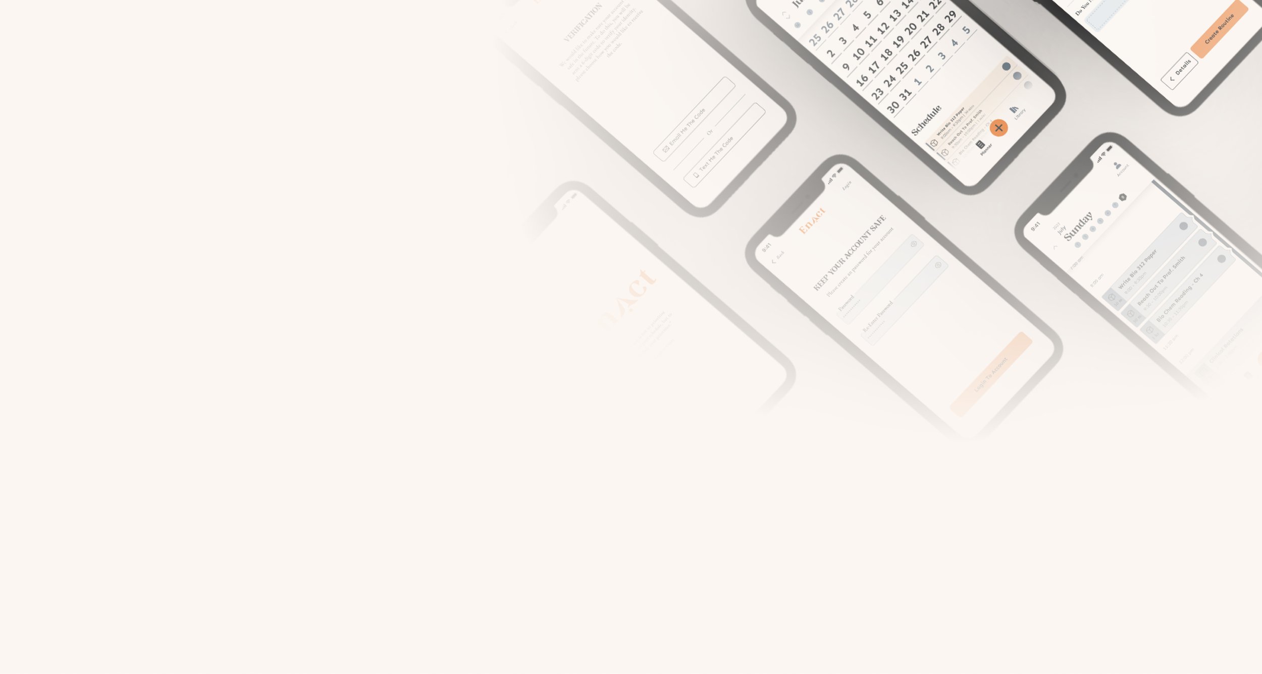
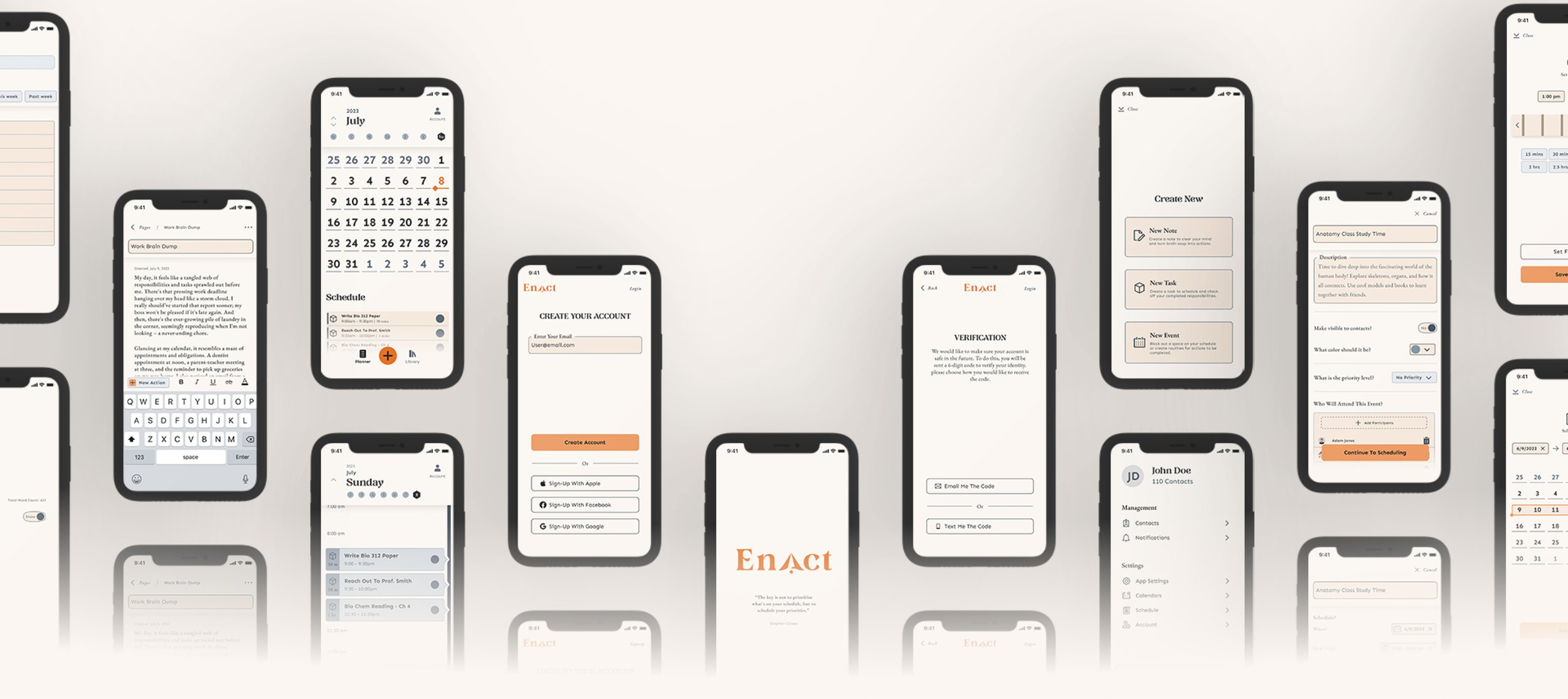
High Fidelity Wireframe & Prototype Iterations
After building my design system in Figma, I began translating my wireframes into High fidelity inside Figma. Since the Wireframes expressed the overall structure, I knew there would be different updates and changes to the high-fidelity designs I would need to make. I rapidly iterated through designing the high-fidelity screens, updating my design system as I went along. Once I had created my High Fidelity screens, I began stitching them together to create a clickable prototype that I would use for testing. Figma had just released a new update giving access to variables. I took advantage of this update, creating variables to help make my prototyping quicker. As I tested my prototype with users, I went through this process again to incorporate feedback and update the design. Through the use of the design system and component kit I built. It made it easier and quicker to make updates based on the feedback I received in testing.
14/20


User Testing
Testing Strategy
I was looking to validate the core app features and detect what parts of the flows posed usability issues. I decided to use Trymata.com to recruit and run unmoderated usability tests. I created a survey screener again to find 5 participants in my target audience for each feature’s test and ran a pilot test to make sure the tests made sense and worked without any issues. I focused on using Trymata’s Adoption Likelihood Factors Questionarrie (ALFQ) which focuses on four specific metrics: Desireability, Usefulness Usability, and Credibility. I also planned to observe survey responses to determine if the app was Useful and Desirable to validate the app’s core features as a good solution and task success metrics to detect critical usability issues.
Moderated User Testing Round 2
I conducted a second round of usability testing to determine if I had improved or fixed the usability issues I had discovered in the first round of testing. As much as I wish I could say everything was sorted out and well, I discovered new issues I hadn’t before. While the performance of the Create New features, such as the Braindump feature and Focus Time (now combined into events) Feature improved, the navigation of the planner feature in the app performed worse. In the first round of testing, the planner feature tested fairly well but had a few minor and normal issues.
Moderated User Tests Round 1
After conducting my first round of usability testing, I discovered a few critical problems. The first of these was that users were struggling to understand the mental model of the Braindump feature. The structure of the flow and UI was not a familiar enough pattern, causing users to struggle to figure out how it worked, even though they could complete the test. On top of this, the label braindump didn’t make sense to users, and some of the signifiers didn’t grab their attention enough for them to discover important elements of the feature.
Critical
Multiple users could not complete a task. These issues are issues I must fix before I move forward with my app.
Major
Multiple users struggled to complete a task. These issues are important to fix before I move forward with my app.
Minor
Users completed a task but raised concerns about design choices. I should fix these issues when time allows.
Normal
Users identified a cosmetic problem. I should fix these issues when time allows.
Key Insights
After conducting usability testing, I was able to identify critical issues in my design. Participants gave mixed ratings for the apps Usefulness and Desirability. The responses, despite the usability issues encountered, was still moderate, leading me to believe it was usability issues that left participants unsure if the app was of value to them. After the second round of testing, I found improvements in previous critical usability issues and had new critical issues in other features of the app. While the second round of testing showed new Usability issues, it also increased the survey response scores in Usefulness and Desireability, validating the app’s core feature set as valuable to my target audience.
The next critical issue was that users had a similar struggle in understanding the mental model of the Focus Time feature. They struggled to understand the label and how the feature was different from an event. They also had trouble navigating in between the details and scheduling while creating a focus time. I also discovered a few minor usability issues with the design system. While they didn’t pose a task completion issue, I noticed users being confused or struggling with these issues during the test.

16/20
18/20
In the first round of testing, the planner feature tested fairly well but had a few minor and normal issues. Users struggled a bit in navigating to the calendar as the planner levels weren’t clearly expressed to indicate the ability to navigate. Along with this, some users felt confused by the schedule label for this section. After these updates, the test performed worse as it was clear that all the users, unlike the first testing round, struggled with gesture controls. This section was mainly navigated through gesture controls. As the users preferred to interact by tapping, they struggled to navigate to the different sections of the calendar.
17/20
try out the prototypes
Account Creation
Schedule Navigation


These issues were mostly cosmetic, such as a button didn’t stand out enough at first glance. I assigned each of these issues a rating on a scale from critical to normal and began to make updates to the designs. I then began iterating and redesigning the application, starting with the critical issues, to improve the usability issues I had uncovered.

Creating a New Action
Retrospective
Key Takeaways
This project was a challenging project to take on. I researched, ideated, and designed a solution to test. The testing metrics validated the product as a valuable solution for my target audience. I also found that the design had some usability issues I had hoped to correct. Looking back, I wish I had conducted the first round of usability testing to focus solely on validating the core feature set of the application early on with a low-fidelity prototype rather than a high-fidelity prototype. If I worked on a project like this in the future, I would make this adjustment. This early concept testing would help me determine if I was on the correct path from the start and allow me to focus on usability issues afterward. In the future, I believe I could do a better job probing the participants in the usability tests to understand what the core issues with the application are. This probing would help me limit redesigns and help me to move forward faster.
Next Steps
If I moved forward with this project, my next goal would be to correct the usability issues in the planner feature, beginning with its use of gesture controls for navigation. This would be a critical issue that I could quickly address and would have a big impact on the experience. After I made updates to the UI and Architecture of the app, based on the feedback from users, I would look to conduct moderated tests with users. This would allow me to speak with users directly and get a better understanding of why they might dislike the app or be struggling to understand and use some of its features.

20/20

Thank You!
Thank you for reading this far! Feel free to explore some of the other projects I've undertaken below.

