


Project Kickoff
Project Guidelines
Prep
Going into a museum is an overwhelming experience for many visitors. If you don’t have an art degree or even if you do, you can be left wandering around wondering about what you're looking at. Aside from artworks you might have prior knowledge of, it feels daunting to navigate finding information, contextualize, and gain any value from or about all the artworks you come across. Sometimes the experience can be enhanced through joining a guided tour, but should you need a tour every time you visit a museum? This is the issue Gallery Pal seeks to address, an app aimed at bettering the experience of museum/gallery visitors at in-person events. I was challenged with producing a design solution for this problem within only a week. To help me design Gallery Pal’s product solution, I was provided a design brief that included background information on the product, and research about the target audience.
Making Sense of the Brief
Role - Product Designer and Researcher
Timeline - 5 days
Tools - Figma, Asana, User Interviews, Lookback.io, Miro, Notion, Google Sheets, Google Forms, and Google Drive
A technique that helped me manage this was timeboxing. I chose to use a time boxing tool called structured. It allowed me to plan activities and tasks for the design sprint by the hour. By enabling notifications, each time a notification would go off, it acted like a trigger for me to mentally refocus and zoom out to reframe my perspective and identify where I was. By doing this, I was able to catch myself from going down rabbit holes and prioritize my focus on what would be of most value in the sprint process. This became a tremendously useful method for navigating the ambiguity of the project across the course of the week.
According to the project brief, Gallery Pal aimed to help museums improve customer satisfaction while viewing art. Their product needed to be a mobile app experience that focused on improving the in-person viewing experience of art such as sculptures, installations, & paintings while at the museum. To help me prepare for this project, I examined the information provided and began by making sense of what I would need. I took a step back as I prepared to take on this design challenge. I believe that diligence and passion are core to producing products of value and that valuable products have the opportunity to impact the world for the better.
One of the ways this tends to manifest for me is in how I enjoy getting immersed in a design problem and meticulously ideating products that offer a set of valuable features that excite. I realized this could be a problem for me on this project. I wouldn’t have the time to waste trying to chase every option I could come up with. I needed to reframe my perspective on the quality I was aiming for. My sense of quality would need to focus more on creating an MVP that I could verify was moving in the right direction. Reframing my perspective helped me shift my focus from being meticulous in the space of visual design to the space of design strategy.

Project Planning
Timing was the biggest challenge I knew I would have to navigate. Improving customer satisfaction while viewing art was a broad goal with an endless number of possible strategies. I needed a way to structure myself moving forward and sculpt the abstract brief and ideas into a concrete product without getting sidetracked or chasing my tail. I planned to conduct a Google Ventures design sprint to help me work quickly and efficiently. I used Miro to set up a digital whiteboard and built out sections for each day of the sprint. Organizing the whiteboard provided me with the overall structure and plan of activities for each day of the project.
With the last day of the Google Ventures sprint method dedicated to user testing of the product, I knew that meant I would have to find a way to recruit users during the week. Anytime spent recruiting users for testing meant less time to design a good user experience and solution. With this in mind, I decided to find a stack of research tools I could use to help me source participants that would be relevant to me and allow me to conduct user testing remotely. I planned to use Lookback.io then to administer the user tests. I settled on using User Interviews to create screener surveys to source participants from their recruitment pool. I could integrate this tool with lookback.io to easily send participants to the tests and minimize wasted time on recruitment management.


Discovery
I kicked off Day 1 of the design sprint by reviewing the research provided by gallery pal. I recieved an expert Interview of a museum tour guide with quotes from the target audience and a complied user persona. As I watched the expert interview, I took notes on the tour guides goals and what users seemed to find valuable or hoped to gain. These notes helped me to digest the information to better empathize with the user persona provided and imagine the issue from their perspective. The audience, as represented by the persona, was roughly 23 years old and lived in the city. They tended to visit the more popular museums alone, wanting to take advantage of the world-class art available. They tended not to look for any specific artist or exhibit but instead prefered to browse whatever work was being showcased. This audience often felt frustrated that they didn’t know more about the art they were viewing as they didn’t find an easy way to learn about it without having to spend alot of time looking through books and articles to find information they found valuable. They were looking for a way to find quick information about the art they viewed to make them feel they were getting the most out of their visit.
Liza
“I often wonder - what would the artist tell me about this piece if they had a minute to talk to me? How cool would that be?!?”
Mapping
Dana
“There are so many times I find myself saying ‘how did the artist do that?!’ - I would love to know more about their process and technique.”


To help me continue making decisions about what would be relevant for the MVP versus irelevant, I started brainstorming what risks could be present for the product. Brainstorming risks helped me plan ahead and view the product’s concept from the perspective of any challenges or issues that might arise during adoption. It allowed me to concentrate my focus on the core problems the MVP sought to solve and how it could be useful to the target audience. I then restated these risks in the form of “how might we…" questions to reframe the problems and brainstorm different core features. After affinity mapping these How might we questions, I noticed some common themes to orient my focus on solving for the MVP.
In trying to determine how to create a mobile experience for a live event, I felt challenged in ideating a concept that didn’t distract viewers from the experience of the art in front. Instead the core experience would need to empower them to understand, engage, and experience it better. Following the design sprint process, I began brainstorming and mapping the user journey and flow. As the brief seemed to imply that the application would be for museum guests rather than museum tour guides and employees, I moved forward on this assumption. I brainstormed the steps of the user’s discovery journey, followed by ideas of a content that would be important to the core application experience. I then compiled this information into a user flow diagram of the MVP.

Claire
“I may do a little research before my visit, but I always find a work of art that catches my eye that I didn’t read about beforehand.”
Ryan
“I don’t really enjoy group tours because I like to do my own thing… but sometimes I listen in to learn a few facts about the artist, or the piece itself.”
Audience Insights
The guide mentioned a few insights that stuck out to me. I noted that guests were intrigued by the artists’ story and knowing how they became artists or how they accomplished certain things in their work. She aimed to help guests build this story through context, fun facts, and the reasons behind their artistic choices. Another insight that stuck out to me, was how a tour enhanced the in-person experience. Being able to inform the guests of whatever artwork interests them personally in the moment, allowed them to sit and experience the artwork deeper. She observed this was lost for people who tried to research it individually. Either they would research before arriving, removing them from the immediate experience, or they got caught trying to navigate and make sense of a large amount of information in the moment rather than being able to experience the artwork.
Defining the problem
With all this information, I needed to set a direction for the MVP's approach, but I didn’t know what I should dedicate my focus to exploring or how I would decide that I was moving in the right direction. I was starting from scratch with a product that had no previous direction. In order to begin mapping out a solution, I began at the end and worked my way backward. I needed a vision for the product and a method for improving the in-person experience. I tried to imagine what the product might look like or do if everything went perfectly. I concluded that the long-term goal for the product was for attendees to feel a personal connection and a heightened sense of knowledge both during and after visiting an exhibit. I aimed to have the MVP accomplish this objective by providing users with confidence and a sense of empowerment to explore and research any art or artist that resonates with them.
Ideating Goals
I referenced the mission to improve the in-person viewing experience and my insights gained from the research provided about guests to help me brainstorm different goals. After generating a few ideas, I voted on which goal seemed to be most in line with the core mission of Gallery Pal.
Deciding my direction
As this would be the inception of this application, there seemed to be any number of metrics that seemed important to get right, and trying to know which metrics to focus on and why seemed a reasonable argument. I brainstormed out different metrics and the key results that I could use to determine my MVP’s progress toward my long-term goal. My time boxing reminded me that for the purposes of this project, I needed to focus on what I could immediately measure at the end of the week. I decided that the primary focus was to validate that, whatever the core features of the application would be, were valuable to users. If the core experience wasn’t of value and didn’t seem to excite the customers, then no one would bother with the app in the first place. I planned to use an Adoption Likelihood Factor Questionnaire (ALFQ) focused on desirability and usefulness. Along with the ALFQ I would measure open-ended question responses to gauge their overall perception of the product’s concept.
Understand
Day 1/5

User Testing Plan
On the second day, I dedicated my time to sketching and recruiting. Since I had already setup User interviews and integrated lookback.io, I only had to write up a screener survey to post and start recruiting participants. Writing the screener survey didn’t take much time allowing me to focus most of my effort on researching, sketching and ideating an MVP. I knew, based on the user persona and the goal of the application, that I would be targeting participants who were between the ages of 18-35, Casual museum/gallery visitors who were interested in making the most out of their museum visits and would be available by Friday to test. I also decided to focus on IOS users only. I then created and distributed the screener survey to find participants while I focused on Ideating a solution sketch.

Lightning Demos
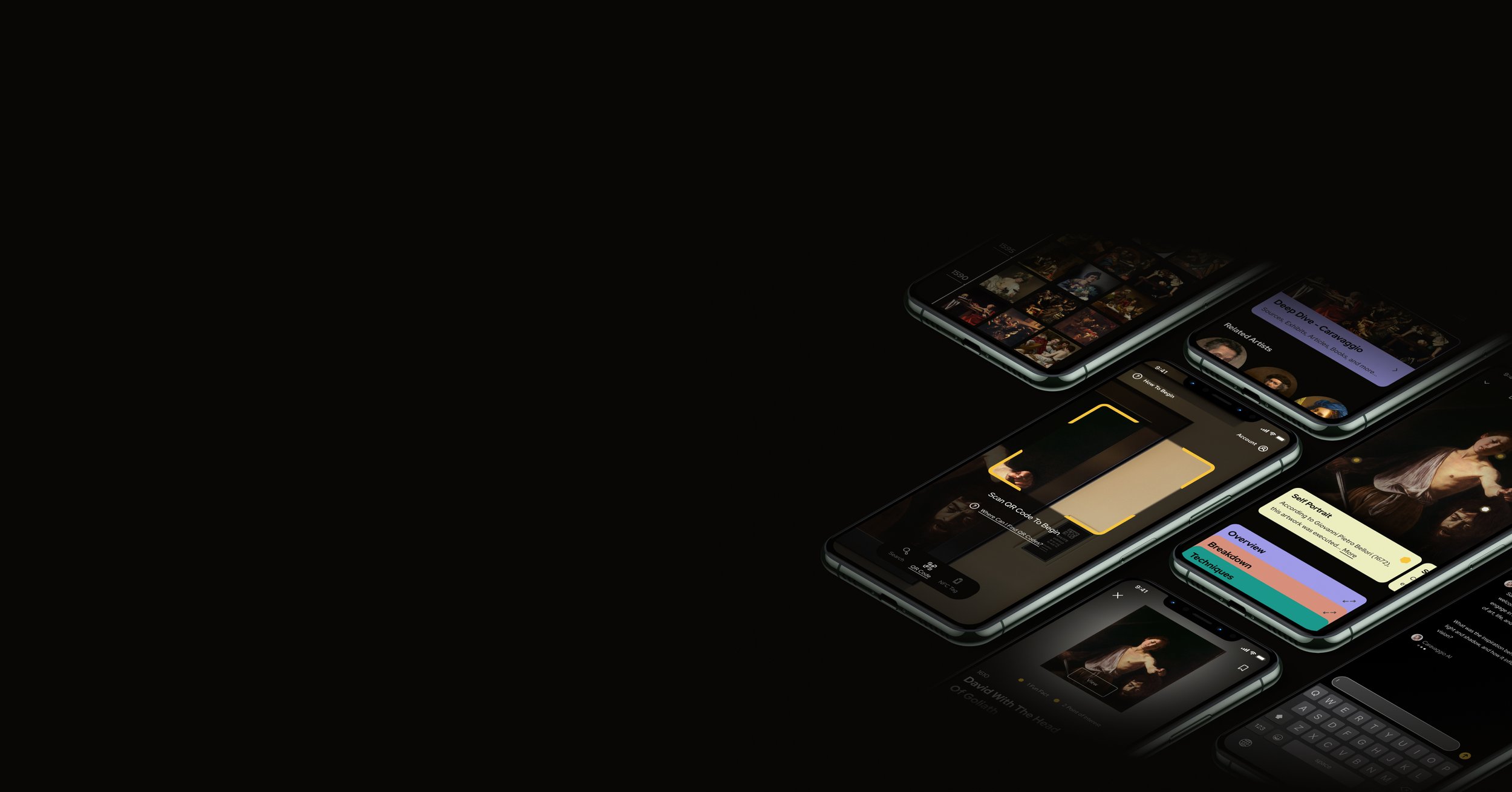
I then set myself to sketching out ideas in the form of more HMW questions, potential user flows for the app features, and a crazy 8’s exercise to sketch wireframe concepts of essential screens. I found myself stuck on how to help users find information in an easy way without distracting them from the in-person experience. As I sketched through different concepts and reviewed the lightning demos, I had a breakthrough idea to use a QR code. Not only did it seem to be an exciting and great way to bring people into the app, but it could also help users immediately find the information they wanted while limiting the distraction from the in-person viewing experience.

At this point, the MVP experience was still abstract. If I was going to have a product by Friday, I needed to make the MVP more concrete. I was unsure what features or functionality could work in the environment of a museum and not be irritating to the in-person viewing experience. I conducted some quick secondary research on museum galleries to get a better sense of the environment. I also gathered inspiration from various apps to help me find patterns and determine what components and functionality I could use for my app’s MVP that would be congruent with the core concept and objective. This research helped me find concrete examples of features to explore. I used mobbin and pageflows to help me quickly source relevant inspiration and organized the screenshots on the whiteboard by the feature types and reference source.
Building The Structure
I finished the day by reviewing my sketches and coming up with a solution sketch that showed the core experience and app concept in a 3-panel storyboard. The solution concept for the app I came up with was to gamify the experience of viewing art in person by using the camera on your phone to scan QR codes related to a selected artwork.
Breakthrough 1
As I sketched through different concepts of this Idea, I realized scanning a the QR code to learn about various artworks could act as a method of gamification for the in-person viewing experience as it promoted the excitement of finding new information and artworks to engage with.
Being Aware of Bias
Personally, I enjoy museums and might have biased ideas of my own as to what features I’d like in an app. To be careful of my bias as I explored the MVP features, I repeatedly referenced the user persona and notes on my target audience. Since the artists/artworks story and context were most important to my target audience, I searched for features that might help me present this information while keeping users present and in the moment.


Breakthrough 2
Another breakthrough feature was an AI chatbot. I believed it could be a unique way to allow users to talk with the artist and get specific information about them or their work, leading to further engagement with the art or artist. I was unsure if it would be received well, as I knew people have mixed feelings about AI.
Day 2/5
Sketch
I then began to create a wireflow of the experience to work out all the components and content that would need to be prototyped. While designing the low-fidelity screens, my main focus was error prevention and how someone might unintentionally get lost or confused. Thinking from this perspective helped me decide on which components I would need to use. I began to design low-fidelity screens in Miro based on the sketch ideas I had come up with the day before. Since the starting point for the user’s journey in using the app would be to learn about a specific artwork/artist, I decided that the starting screen should be a camera screen. This decision would direct users to immediately locate information about an artist or artwork without causing them to go looking for how to find this information and be distracted from the in-person experience. From here, I wireframed each step of the experience and interactions to build a wireflow architecture.
Envisioning a visual aesthetic
Before I could begin creating a high-fidelity prototype of the experience, I needed to figure out what the app should look like. In adherence with Nelson Norman’s usability heuristics, to provide legibility, and to allow the discovered artwork to hold the main focus, I determined the app should be brutalist in style. I brainstormed a few visual directions and began to compile mood boards in Milanote on these directions to help me visualize the potential style. Since the target audience was looking to use this at museums and had an interest in art and a concern for the information being credible, I decided it should have an academic and trustworthy feel. As I explored different serif typefaces and muted color palettes, I realized that it still needed to feel modern. My target audience was young. I decided I would use a bold San serif typeface for a modern look. For the color palette, I chose a high-contrast black and white palette with a sharp, saturated yellow to communicate curiosity and highlight important information.


Storyboard
Deciding A Solution
Day 3/5
On day three, I dedicated my time to designing the skeleton of the core experience. I needed to prioritize my effort on the design of one specific flow for the MVP to prototype, or I wouldn’t have a prototype in time to test. I reviewed my sketches and notes from previous days to decide which flow of the app I should tests to give the best understanding of how the app would perform towards my goal. I decided to use the flow path of a user scanning an artwork before navigating to the artist’s page to learn more about the artist and using the chatbot feature. This path would give the participant a good idea of what the app was about and what they could do with it by demonstrating the core experience of the MVP.


Wire framing & Wireflow
Starting Point
I intentionally kept the camera screen design as simple as possible to guide users into scanning the QR code easily and intuitively. I focused only on adding components that navigated users to relevant information. As some users might not know what to do with the camera, or how to search, I designed guidance text below to direct users on how to begin the experience as well as a pop-up link for further FAQs if they were confused about how, when, or where to use the camera feature. Each of these decisions helped prevent the user from making any accidental navigation towards information that wouldn’t be relevant to them or might lead them to be distracted from the artwork in person.
Ending The Day
By the end of day 3, I mapped out a wireflow and determined a visual direction for the prototype. I checked my screener survey and found that I had gotten multiple potential testing participants as well. I managed to schedule all 5 of my participants for different times on Friday.


Prototype
I dedicated my time on day four to creating the prototype of the app. I knew I would still need to iterate as I designed, but that could cost me a lot of time. To prevent wasting time while making changes and to standardize the designs to make sure they were cohesive, I built a design system based on the visual aesthetic I decided on the previous day. I created a color palette of neutrals and an extended color palette of the brand color as the primary color primitives. With this, I could use the colors to create different component states or guide visual focus while keeping the aesthetic of the designs cohesive. I decided to add a semantic color palette of secondary colors to be indicators of contextual content and information.


Layout Grid
Last, I created a four-column grid to uniform the layout of the screens. With this, I was able to ensure the content on the screens was uniform to scale. Along with the grid, I created a spacing system to ensure layout consistency and spacing amongst individual elements and provide a visual rhythm and harmony for the UI.
try out the prototype

Creating the Design System
I also created a type-scale system to help manage the font sizes and legibility of the text throughout the design. Since I was designing a mobile app and I wanted to ensure the type would fit while still affording a decent level of contrast between the steps, I based the increments on the minor 3rd scale. The scale was based on a baseline of 16px to ensure the text would stay legible and wouldn’t be too small to read.

Variables & Styles
I used Figma’s variable system to add in and manage each color system. Using variables and styles made it easy to update and change colors throughout the designs at a master level while keeping the document organized. I used Figma’s styles to build my type scale system, allowing for a combination of text formatting to help me manage the typography in the same manner.
Building Components
Once I had built the design system, I began to create the prototype. I built components in sets to allow me to design each state of the components and increase the intuitive feel of the prototype. Designing and building the components before building the pages made it quicker and easier to build and make changes to the pages. Building page layouts became as easy as adding or removing components.
Day 4/5
On the last day of the sprint, I conducted the moderated user tests. I had already recruited and scheduled 5 participants through the User Interviews platform. Since I was aiming to gather insights on the MVP’s direction, a 5 participant sample size would be enough to collect a diverse perspective under my time constraints. I created a user testing script and created a test in lookback. I made sure to run a pilot test to ensure that it worked without any issues, then linked the lookback test to user interviews so the recruited participants could get to the test. I conducted moderated usability tests to observe participants while they interacted with the prototype so I could also ask them questions. Conducting moderated tests allowed me to get the qualitative feedback feedback I needed.

28
Desirability High Score
+

28
Usefulness High Score
=
56
Combined Adoption Likelihood High Score
Scoring The Test
I scaled each question with a response from 1-7. The highest possible score for both Desirability and Usefulness was 28. Afterward, I input the data into a spreadsheet to average out the desirability, usefulness, and combined scores. The highest score in each category was 28, leaving a highest combined score of 56.
Insights
After conducting and analyzing the responses from users, the app received a combined score of 50 / 56 on desirability and usefulness. The report successfully validated the concept as a viable option to move forward with. I noticed that participants found the app to be slightly more useful than desirable. When asked about the application, the main complaint about its usefulness or desirability was that participants felt the medium of a mobile app could distract from the in-person viewing experience. One participant suggested an audio explanation/tour feature to allow people to listen while viewing the art live to avoid having to stare at their phones. One insight I found interesting and surprising was that half of the participants found the chat with AI artist feature to be odd. They felt concerned if they could trust the information it would provide. One participant stated that it “felt like a gimmick”. I found this very interesting as it seemed like a feature that would gain attention and be of interest to users. The research meant I would likely need to conduct more research to reconsider the feature and redesign it if I were to move forward with the product.
Usability Issues
I was able to discover a usability issue where participants were struggling to find the points of interest and fun facts features about the artwork and how to view them. I observed the design did not align with the participant's mental model, and the UI components and style blended in with the rest of the page that they often glanced over.
Preparing For Testing
I was worried that participants would struggle to get to the Lookback.io test from User interviews and might get confused or lost with the onboarding process for Lookback.io since I wasn’t sure how many participants had used the platform before. I wrote out instructions on how to access the lookback.io test and how to walk through the onboarding process. I added these instructions to the user interviews project and sent the instructions to the users. All of the participants were able to take the test, and I ended up with no issues meeting with the participants.
I used an ALFQ survey following the test to assess the desirability and usefulness of the design. Based on the metrics I set on day one, the result I hoped to get was desirability and usefulness scores above 23 for a combined score of 46. This score would indicate that the large majority of participants felt the app would be of use and would want to use it, validating the concept of this MVP core experience as a worthwhile strategy. I was also looking to gauge feedback about what issues participants had while using the prototype. I wanted to measure the sentiment and perception users had about it based on how they spoke about it.


Day 5/5
Testing
Validating the concept
Retrospective

Key Takeaways
The challenge of this project was to design an app in 5 days for customers of museums to help enhance the in-person experience of viewing art. Designing a solution under this time constraint was a challenge. It helped me to learn ways to quickly reframe and consistently ask myself if the work I was doing added value or if I was being distracted. It forced me to prioritize my focus on what would bring the most impact, and within only a few days, I was able to determine an app strategy and gain the insight that my direction was worth pursuing.
Next Steps
If I were to move forward and continue this project, I would start by improving the Point of interest and Fun facts experience of the artwork viewing. This update would be a small task that could quickly add to the usability and overall adoption likelihood. In the long term, I’d like to explore different audio features I could add to the experience to remove the need to be distracted from the in-person experience by their phone. I would also look for a way to improve credibility and trust with the AI artist chat. I would plan to conduct moderated interviews and A&B tests to understand further the distrust or dislike of the AI chat feature and how I could improve it.

Thank You!
Thank you for reading this far! Feel free to explore some of the other projects I've undertaken below.

